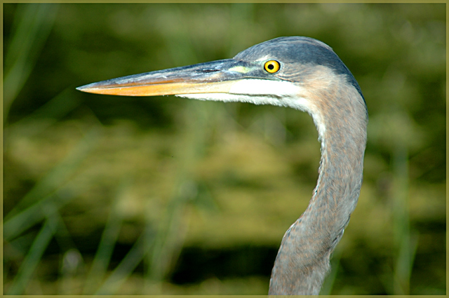
i like the use of controlled dof to highlight the birds head. The vast majority of the image is right on the money from an exposure standpoint, except for that ever so small amount of white under its chin.
I think you could even go further to blur the background - the grasses still seem to distract a bit and using a blur tool might even add more distinction
You did a very good job of catching a classic heron pose against a great "bokehed" BG. The eye is especially sharp and striking.
On the sour side... ummm, can't really think of anything. The composition is right on... If I was picky, picky, I guess I'd wish for side lighting that would provide more contrast and texture in the feathers? But that's really pushing it.
ooooo this would have almost been a brilliant entry for the recent S curve challnge (though no doubt people would have told you that you S was not pronounced enough).
Somebody recently said on one of my challenge pics that the eye of an animal was not brought out enough, but that is definitely not an accusation that could be made here and the colour contrast with the muted colours of the herons (?) body is fantastic and draws attention immediately
The bokeh really gives the picture a 3d feel and I like the khaki border which is understated enough not to detract from the shop but gives the picture a nice sense of completeness
Lovely composition and application of the rule of thirds.
As for my 'sour' comment....Boy thats a hard one. Possibly a touch of burning on the beak or a fraction more USM but these really are very very minor points.




 Add photograph to your favorites
 Add photographer to your favorites


 Photographer found comment helpful.


