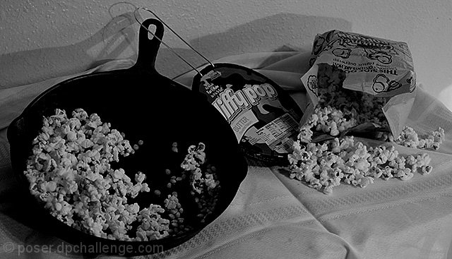
still learning my bigest challenge is taking the idea from my head and putting it in a photo.
cropped
color adjustment to black and white
resized
usm
saved for web
Statistics
Place: 56 out of 74 Avg (all users): 4.7381 Avg (commenters): 5.2083 Avg (participants): 4.6061 Avg (non-participants): 4.7548 Views since voting: 878 Views during voting: 407 Votes: 294 Comments: 24 Favorites: 1 (view)
They still make Jiffy Pop? Overall, this looks very gray to me. Nice blacks, but the whites are a bit dull. Perhaps a levels adjustment would have helped.
Great idea. It is amazing to see how popcorn popping has changed over the years. Although, I thank god we have moved past jiffy pop because I ALWAYS burned it.
I wish the black and white contrasts were a little stronger so that at least the popcorn would be brighter and stand out more. Good luck!
Pictyure is a bit too dark, turning the pan into one big black lump en the popcorn into something greyish. Harsh shadows are not my cup of tea either. (4)
Well thought out. I think your choice of black and white gives equality to the three. The darkness and size of the skillet would have dominated in color. Nice work
shot seems too contrasty for me ... actually the overall feel is "disturbing" It looks like something from a B movie. If the pan weren't so dark it would be about a 7





 Add photograph to your favorites
 Add photographer to your favorites


 Photographer found comment helpful.


