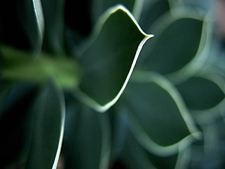
This is cool. I like the edge of light on the main "one". Maybe a tighter crop would eliminate the one on the lower left? unless of course you want the viewer's eye drawn down there.
I Love it too. those white lines really make this shot....would be perfect if the one on the bottom wasn't leading your eye off the page. I really like the deep greens and dof.




 Add photograph to your favorites
 Add photographer to your favorites


 Photographer found comment helpful.


