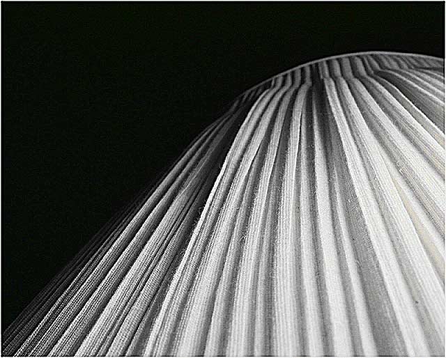
Very nice. I like that this was converted to b/w, it's more artistic and has more character to it. The lines that lead the eyes to the tilted top (which is also nice) and the gradient disappearance of the texture towards the bottom right made the composition very interesting. 9
Very nice idea, and pretty fine execution of it. I find the composition a bit irritating, however: I think I would have likes the crown of the shade more solidly in frame, allowing the eye a real place to be drawn up to - as it is, I think you draw the eye rather more out of frame than to any particular point. Would have been marvellous for textures, also.





 Add photograph to your favorites
 Add photographer to your favorites


 Photographer found comment helpful.


