| Author | Thread |
|
|
10/31/2007 01:08:41 AM |
|
Expected this to do better. (Probably too dark for DPC). |
|
 Photographer found comment helpful. Photographer found comment helpful. |
Comments Made During the Challenge  |
|
|
10/29/2007 10:11:20 PM |
|
Appears a bit dark. Still a good one! |
|
| Photographer found comment helpful. |
|
|
10/29/2007 04:40:39 PM |
|
| Photographer found comment helpful. |
|
|
10/28/2007 02:53:06 AM |
|
| Photographer found comment helpful. |
|
|
10/27/2007 02:02:40 AM |
|
Commendable. First photograph to make me really think about distance. |
|
| Photographer found comment helpful. |
|
|
10/26/2007 04:32:12 PM |
|
Low contrast, though that is probably by design. |
|
| Photographer found comment helpful. |
|
|
10/25/2007 02:58:20 PM |
|
A clever idea, but I find the grey tones a little flat. |
|
| Photographer found comment helpful. |
|
|
10/25/2007 01:35:42 AM |
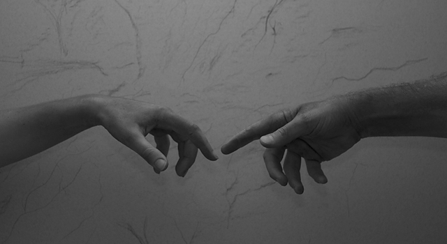
Good concept.
I feel couloured rendering would have done justice.
Lighting looks flat and composition could have been better |
|
| Photographer found comment helpful. |
|
|
10/24/2007 02:18:37 PM |
|
| Photographer found comment helpful. |
|
|
10/24/2007 12:17:34 PM |
|
This is a cool idea and texture of the wall adds to the look. But it's waaaay too dark. |
|
| Photographer found comment helpful. |
|
|
10/24/2007 09:53:09 AM |
|
|
|
10/24/2007 12:27:33 AM |
|
COOL take on the classic painting. Wish the lighting were a smidge better. |
|
| Photographer found comment helpful. |
Home -
Challenges -
Community -
League -
Photos -
Cameras -
Lenses -
Learn -
Help -
Terms of Use -
Privacy -
Top ^
DPChallenge, and website content and design, Copyright © 2001-2026 Challenging Technologies, LLC.
All digital photo copyrights belong to the photographers and may not be used without permission.
Current Server Time: 06/28/2026 09:28:20 AM EDT.