| Author | Thread |
|
|
11/23/2007 03:57:51 PM |
|
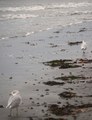
Have fun with those reverse macros - they sure are addictive. :) This is a great illustration of distance - especially in the macro world, where depth of field is so miniscule. |
|
 Photographer found comment helpful. Photographer found comment helpful. |
|
|
11/02/2007 03:44:37 PM |
Michelle
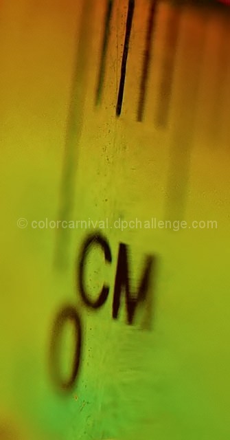
God it can be depressing how you can get 'punished' for trying out new things. Maybe the tape measured scared the chaps lol
As has been said not necessarily a dpc friendly image but I love the fact that you experiment and hope that you were not too fed up with the score |
|
| Photographer found comment helpful. |
|
|
11/01/2007 10:13:35 PM |
|
Cool idea and even better colors. Wonderful slow grad. |
|
| Photographer found comment helpful. |
|
|
10/31/2007 07:06:39 PM |
|
good idea, michelle. i like this a lot. |
|
| Photographer found comment helpful. |
|
|
10/31/2007 07:18:51 AM |
|
Just not DPC friendly, however, it is a good macro and as you say, you were playing with it. |
|
| Photographer found comment helpful. |
|
|
10/31/2007 04:27:40 AM |
What? Not even a 5???? Crap.
I gave this a 10... I thought it was brilliant. Gorgeous colors, DOF, composition, and I LOVED how it conveyed "distance" without going the "long distance" route. |
|
| Photographer found comment helpful. |
|
|
10/31/2007 01:43:01 AM |
|
Great OOBie idea. I like it a lot. The colors and DOF are great. |
|
| Photographer found comment helpful. |
|
|
10/31/2007 01:03:28 AM |
|
Love this, Michelle! DOF and colors are awesome. Has a great grungy feel to it. Too bad it was underappreciated by the voters. |
|
| Photographer found comment helpful. |
|
|
10/31/2007 12:44:29 AM |
|
I'm speechless. At least you didn't get the brown. |
|
| Photographer found comment helpful. |
|
|
10/31/2007 12:35:56 AM |
|
Great colors and composition. I like the image, it puts a smile on my face, but sad it didn't score higher. |
|
| Photographer found comment helpful. |
Comments Made During the Challenge  |
|
|
10/26/2007 04:45:25 PM |
Quirky choice.
I like the grungy look and the citrusy hues. |
|
| Photographer found comment helpful. |
|
|
10/26/2007 12:25:20 AM |
|
too shallow DOF. Not enough of subject in photo. |
|
| Photographer found comment helpful. |
|
|
10/24/2007 12:48:57 PM |
|
The dof makes this picture hard to look at. |
|
| Photographer found comment helpful. |
|
|
10/24/2007 04:54:52 AM |
|
I like the idea of the shallow DoF. But what is the green/red dominants? |
|
| Photographer found comment helpful. |
Home -
Challenges -
Community -
League -
Photos -
Cameras -
Lenses -
Learn -
Help -
Terms of Use -
Privacy -
Top ^
DPChallenge, and website content and design, Copyright © 2001-2026 Challenging Technologies, LLC.
All digital photo copyrights belong to the photographers and may not be used without permission.
Current Server Time: 06/28/2026 06:31:37 PM EDT.