| Author | Thread |
Comments Made During the Challenge  |
|
|
10/30/2007 01:57:46 PM |
|
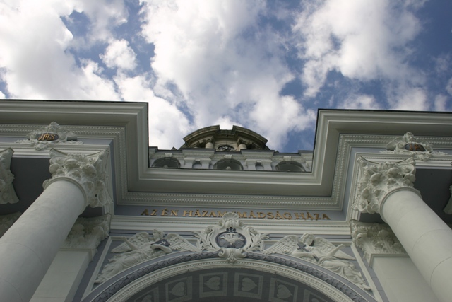
I'd prefer if the horizontal line were straight, and not on an angle. Also, including more of the building to have a more dramatic shift "up" would give it more punch. |
|
|
|
10/29/2007 04:28:23 PM |
|
Great location and sky. The image is rather flat though. I'd have worked with selective colours (if you have photoshop) to bring out the blues and whites more. |
|
|
|
10/28/2007 09:00:41 AM |
|
OK, you have probably heard this already, but this would of been a lot better had you straightened it (legal in basic editing) Also, adding a bit of contrast would of improved the overall feel of the shot. 5 |
|
|
|
10/26/2007 12:34:56 PM |
|
Might have been better if it wasn't crooked. |
|
|
|
10/25/2007 12:47:19 PM |
|
Colours are very bland, needed a contrast pump =) meets the challenge tho |
|
|
|
10/25/2007 04:35:29 AM |
|
I like the clear black line dividing the building from the sky. I also like the symmetry. Just a slight rotation so the lines are parallel horizontally and then a crop would have made the impact greater. Good job overall though |
|
|
|
10/24/2007 04:02:13 PM |
|
I think this is a good shot, but I think it would be better if rotated a degree or two so that the roof line was horizontal. |
|
|
|
10/24/2007 01:28:38 PM |
|
Might have been better if you rotated the picture a little so the roof is perfectly horizontal...not bad though. |
|
Home -
Challenges -
Community -
League -
Photos -
Cameras -
Lenses -
Learn -
Help -
Terms of Use -
Privacy -
Top ^
DPChallenge, and website content and design, Copyright © 2001-2026 Challenging Technologies, LLC.
All digital photo copyrights belong to the photographers and may not be used without permission.
Current Server Time: 06/28/2026 02:48:03 AM EDT.