| Author | Thread |
Comments Made During the Challenge  |
|
|
10/30/2007 10:01:38 AM |
|
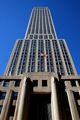
I'm not a fan of the central composition in this case. |
|
 Photographer found comment helpful. Photographer found comment helpful. |
|
|
10/25/2007 02:05:50 PM |
|
Cropped out just slightly and placed more towards the right would have improved composition. The sky looks a little GIF like with respect to colour bit-depth |
|
| Photographer found comment helpful. |
|
|
10/24/2007 02:41:54 PM |
|
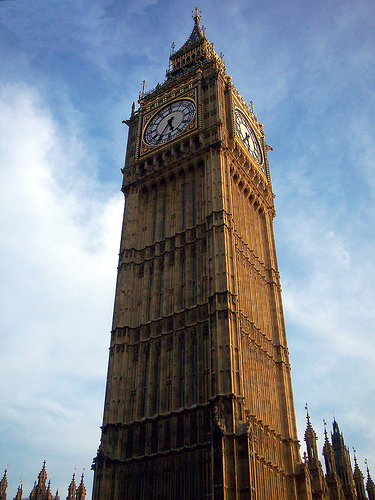
Beautifully done. I wish you would have gaven a little more space for the short buildings around. I could have shown the main object's greatness! |
|
| Photographer found comment helpful. |
|
|
10/24/2007 12:21:37 PM |
|
Excellent choice! Very nice! |
|
| Photographer found comment helpful. |
|
|
10/24/2007 08:43:36 AM |
|
Suggest off-centering the tower and including more of the base structure to give it more height. |
|
| Photographer found comment helpful. |
Home -
Challenges -
Community -
League -
Photos -
Cameras -
Lenses -
Learn -
Help -
Terms of Use -
Privacy -
Top ^
DPChallenge, and website content and design, Copyright © 2001-2026 Challenging Technologies, LLC.
All digital photo copyrights belong to the photographers and may not be used without permission.
Current Server Time: 06/27/2026 07:39:07 PM EDT.