|
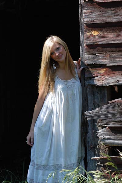
Burning of background is excessive and looks unnatural. Composition feels unbalanced, too much negative space on left, and unsure as to whether you wanted the model in the centre or not. Light is terrible, bad shadows cast especially on the wall and her face. She looks a little too posed, you don't want a snapshot. Her face is a little red/purple which should have been fixed in PS. Lots of highlights in the dress make the composition worse, and take focus away from the face. Inclusion of plants in the foreground looks accidental, you should either have not included them, or make more of a feature of them. Her pose has not flattered her figure, she looks like she's wearing a sack. I would have asked her to bring her hip in or to hide behind the door more. Hands are a very important part of any portrait, it looks like she wasn't sure what to do with her right hand. She doesn't seem terribly sharp, either bad focus or wrong shutter speed. |