| Author | Thread |
Comments Made During the Challenge  |
|
|
09/22/2002 02:55:00 PM |
|
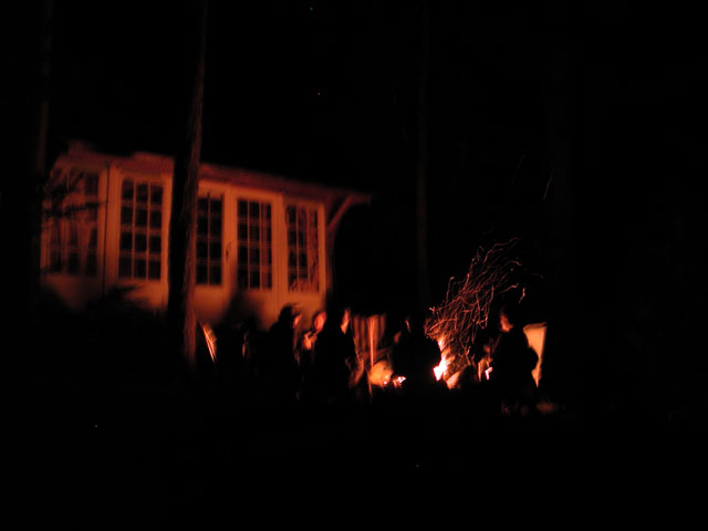
very blurred, and I thinkthe blur does not add to the picture. |
|
|
|
09/22/2002 03:05:00 AM |
|
Eery look to it. It is a little blurry, probly cause the shutter was open a little longer. 5 |
|
|
|
09/21/2002 11:10:00 PM |
|
The effect of the fire is cool. It seems like you have a little shake though, blurring some of the rest of the pic. If this was intentional, ignore me. If not, and you don't have a tripod, I have found that a ziploc bag with flour or sugar makes a nice little beanbag. 'Course to the casual observer, it may look like drugs or soemthing. karmat |
|
|
|
09/21/2002 05:29:00 PM |
|
I think the long exposure, although blurring most of the shot, is a cool effect |
|
|
|
09/20/2002 11:43:00 AM |
Although I am not keen on the blurriness the lighting and darkness of this portray the ambience of the occasion very well. If it were possible to enter non-standard ratios I'd like this with less black on the right or with more on the left to balance it.
6, Kavey |
|
|
|
09/18/2002 11:35:00 PM |
|
I would have liked this better if it had been in focus. |
|
|
|
09/18/2002 08:26:00 PM |
|
these shots are real hard but once in a while they turn out real sweet, totally worth all the ones that are too dark or blurred or whatever. keep on doing this. |
|
|
|
09/18/2002 04:57:00 PM |
|
great shot. wish it wasn't so blurry |
|
|
|
09/17/2002 08:49:00 AM |
|
Good idea. This could be improved with the use of a tripod, or resting the camera on a level surface... or lean against something and hold the camera tight close and hold your breath during the exposure so you don't get any shake. I would expect movement in the people, but not in the building. Try an image like this again sometime, 'cause I'd like to see it. ;) |
|
|
|
09/17/2002 08:39:00 AM |
|
Nice idea. Seems a bit dark. Also focus seems too soft. Good use of negative space. |
|
|
|
09/16/2002 08:42:00 PM |
|
This is terribly out of focus, but it sure has negative space! |
|
|
|
09/16/2002 04:00:00 PM |
|
This photo intrigues me because I think that if it were shot from a different angle, cutting the house out, and just a little closer up, it would have really engaged my interest a lot more. I like the whole feel of the campfire area, but house detracts from the overall image for me. lhall-6 |
|
|
|
09/16/2002 10:07:00 AM |
|
Campfire? In the back yard? Hmmmmmmmmm. |
|
|
|
09/16/2002 09:05:00 AM |
Composition: very nice but it has camera shake 4
Lighting: 4
Appeal: 5, Total Rating 5 Sulamk
|
|
|
|
09/16/2002 04:02:00 AM |
|
shakey.. and not very interesting to look at. |
|
Home -
Challenges -
Community -
League -
Photos -
Cameras -
Lenses -
Learn -
Help -
Terms of Use -
Privacy -
Top ^
DPChallenge, and website content and design, Copyright © 2001-2026 Challenging Technologies, LLC.
All digital photo copyrights belong to the photographers and may not be used without permission.
Current Server Time: 06/28/2026 10:25:47 AM EDT.