Greetings from the Critique Club.
Hi Dave,
Well, you got a bunch of really positive comments, as well as a mass of votes in 4/5 space. A 7.57 avg for commenators is pretty good. You really hit a cord with a few people, but not many. Not much below, and with good reason - there isn;t much to dislike.
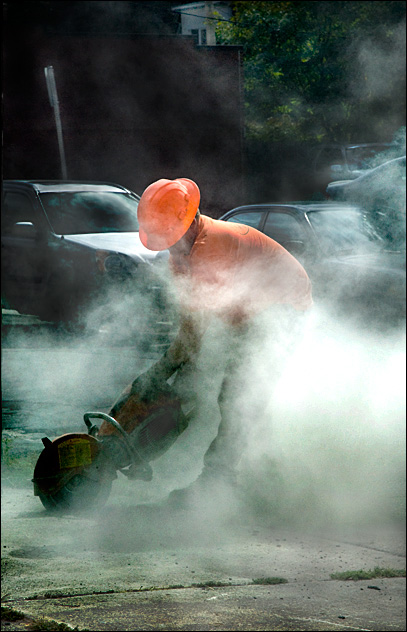
Its an interesting take to critique - as my eye moves over I personally pass from being really engaged to not very interested at all. Lets consider this. The subject and foreground is superb - there is a sense of movement, and action, and power - lovely lines and swirling dust. Would have liked to see more of the workers face - maybe with soem sweat and a grimace, but understand that you couldn't engineer these things. The near-background of the cars, especially the blow-out on the hood is an annoying distraction, and the far-bacvkground is a lto of negative space that doesn't really add value. I think you got a positive reponse from those who dwelt on your foreground and subject.
What could make this a better image? Not too much considerign the circumstances it was made in. Fo mysefl I would have cropped the top off, and tried to burn the hood of the car and the pole.
It is my hope that these insights are helpful and constructive. Please feel free to PM me if you have any questions regarding this critique. And please remember to mark it "Helpful" if you found it so. Good luck with future challenges.
Cheers
Paul |