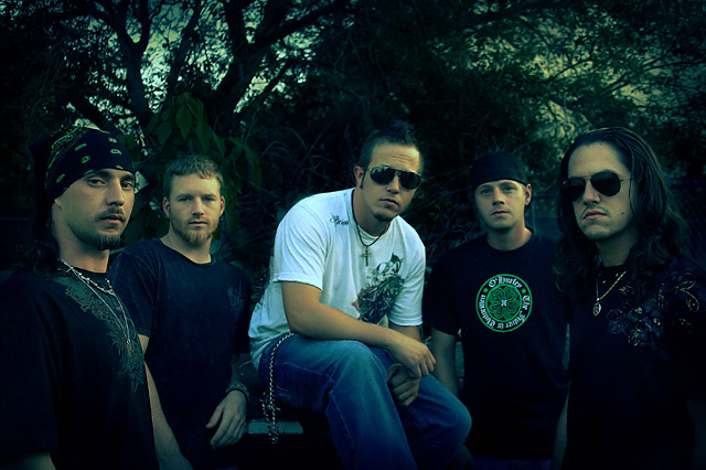
Lets get the bad stuff out of the way first. I am not liking the green tint and would of liked to see the exposure upped a wee bit. However, now onto the good.
Composition is spot on, nice tight cropping has worked well here, a lot of shots in this challenge have left far too much negative space around the sides of the image.
The models are nicely posed , I take it this is a band promo shot.. so, sort out the green tint, brighten it up and bit and it would be great... giving this a 7
I like the dark and green tone to this picture. Could be seen in an album cover.
There is no connection between the viewer (me) and this picture. Of course, there is nothing I can say to help you (since I have no clue how to get that connection). I'm still giving you an above average score for this one.
Tough guys. I like the composition. The one in the white shirt is a boss? Mens portait are difficult. They don't like to smile sweet and hold their arms. You posed them perfectly. There is strengh in them. Bumping it to 9.
Great, love the overall atmosphere of the image. I might have liked a slightly more exciting composition and you migh want to recheck your PP, especially around tough guy #2 and tough guy #4 (7)
moody album cover thing, I like it. Even the green tone works for me. I would have taken that bright logo down a notch though, it commands too much attention in my opinion






 Add photograph to your favorites
 Add photographer to your favorites


 Photographer found comment helpful.


