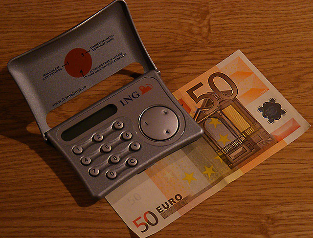
I like the concept but the image itself is somewhat uninspired. Somewhat lacking in contrast, a little too much sharpening, a little noisy. The way the top of the calculator and the bottom of the bill just barely extends past the frame is bothering me- it's like the crop was left to chance, not deliberate enough. Sorry for being so harsh, hope it's at least somewhat helpful. I hate it when my images get low votes with no explanation.
Tks for the comments. It's very helpfull to find out where i'm wrong especialy that i'm a begginer in photography. Tks a lot.
I like the concept but the image itself is somewhat uninspired. Somewhat lacking in contrast, a little too much sharpening, a little noisy. The way the top of the calculator and the bottom of the bill just barely extends past the frame is bothering me- it's like the crop was left to chance, not deliberate enough. Sorry for being so harsh, hope it's at least somewhat helpful. I hate it when my images get low votes with no explanation.
While all the detail captured is great, I find the composition is not what it could be. Also, the background choice is too busy to accent your subjects.
Great subject for the challenge but the composition isn't very interesting to me. Perhaps a different perspective and stronger lighting would punch it up.
What am I looking at? Electronic money? I would like to see either a white or black background. The wood grain is a little busy and distracting. The entire photo could use a bump in contrast.






 Add photograph to your favorites
 Add photographer to your favorites


 Photographer found comment helpful.


