| Author | Thread |
Comments Made During the Challenge  |
|
|
10/05/2007 11:46:57 AM |
|
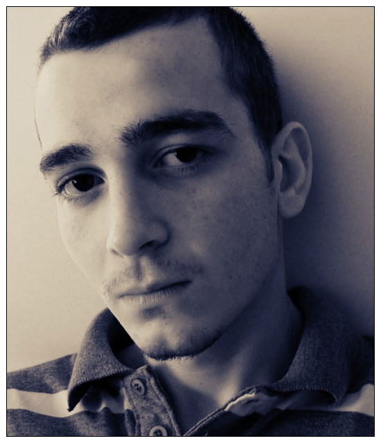
He just looks mad, which to me, doesn't neccessarily mean intense. I'm also not sure if I like the sepia tones in this. I would like to see what it looks like in b/w. |
|
 Photographer found comment helpful. Photographer found comment helpful. |
|
|
10/05/2007 11:16:12 AM |
|
Not sure I get 'intensity' but a nicely taken portrait, and nice PP work. Good shot. |
|
| Photographer found comment helpful. |
|
|
10/04/2007 02:01:43 AM |
|
has an old western feel to it, nice |
|
| Photographer found comment helpful. |
|
|
10/03/2007 05:10:18 PM |
|
This is a great portrait. The light is perfect, the frame/crop works very well, and his pose and expression are great. The duotone choice is nice. The slight softness is intriguing. Title not so good, but that's ok. :-) (First name might have worked better.) 8 |
|
| Photographer found comment helpful. |
|
|
10/03/2007 09:53:54 AM |
|
This does not at all look intense. The tones don't really work for me either. I do like that little bit of light in his eyes. |
|
| Photographer found comment helpful. |
|
|
10/02/2007 05:18:34 PM |
|
The lighting works well here to help the "Intensity" feel of the photo. He looks kinda sad to me with a tear welling up in his right eye. |
|
| Photographer found comment helpful. |
|
|
10/02/2007 01:38:54 AM |
|
This is nice - very somber, dark. I like the way it's processed to give it that feeling. |
|
| Photographer found comment helpful. |
|
|
10/02/2007 01:29:51 AM |
First Impression: nice portrait
Presentation:good
What I Like: the duotone
What I don’t Like: the deadness in the eyes they have no detail in them
IMO, Does it meet the Challenge : yes
Composition: good
Background :good
Subject Placement:good
Cropping:good
Focus: soft but that is ok for this
Exposure:ok
Editing:ok
Total Averaged Rating :6 |
|
| Photographer found comment helpful. |
|
|
10/01/2007 01:47:47 PM |
|
It looks more like boredom to me 4 |
|
| Photographer found comment helpful. |
|
|
10/01/2007 07:38:45 AM |
|
I like the crop and the toning. The shirt is quite ordinary and takes away from the mood you wanted to create (assuming from the title). His eyes are too dark IMO, whole image could be a bit sharper (=more intense) |
|
| Photographer found comment helpful. |
|
|
10/01/2007 03:09:19 AM |
|
Did you use Duotones? Whether you did or not, I like the monochromatic tonal colour effect! |
|
| Photographer found comment helpful. |
Home -
Challenges -
Community -
League -
Photos -
Cameras -
Lenses -
Learn -
Help -
Terms of Use -
Privacy -
Top ^
DPChallenge, and website content and design, Copyright © 2001-2026 Challenging Technologies, LLC.
All digital photo copyrights belong to the photographers and may not be used without permission.
Current Server Time: 06/29/2026 03:47:07 AM EDT.