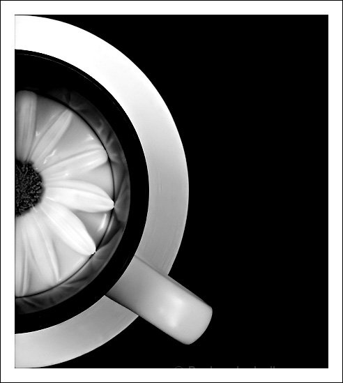
Influenced by the September B&W side challenge. :) This was one of the first ideas I has when I read the challenge description.
*****
Post: I have never thought I would end up in the top 10 with a new personal best. Thank you for your votes and, espectially, for taking your time to leave comments -- I really appreciate them.
Statistics
Place: 10 out of 184 Avg (all users): 6.4872 Avg (commenters): 8.5000 Avg (participants): 6.4286 Avg (non-participants): 6.5294 Views since voting: 2155 Views during voting: 177 Votes: 117 Comments: 12 Favorites: 2 (view)
A fun shot. I love the black & white and the shapes in this shot. I even like the heavy border. It adds to the cool clean effect of this shot. The reflections of the daisy on the cup sides are cool too. My eyes would prefer a tighter focus on the flower but back to bump you up to 8. Very nice.
very appealing graphic work, nice b/w tones. on second look, I ask myself why the daisy is drowning in milk - might have been better to use water or coffee for more contrast inside the cup







 Add photograph to your favorites
 Add photographer to your favorites

 Photographer found comment helpful.


