| Author | Thread |
Comments Made During the Challenge  |
|
|
10/07/2007 09:19:52 AM |
|
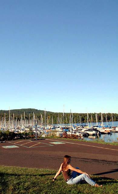
The woman in front does not seem to be interacting with the scene you captured in the background. I think this is a pretty photo but nothing really seems to draw me in. So that is why I am giving this a 5. |
|
|
|
10/07/2007 12:15:02 AM |
|
Actually, if I put my hand over the woman, cropping her out, I like your image better. The woman's pose seems kind of...stiff to me. In some ways, my eyes see it as three images: bottom w/woman, boats, then sky. I do like the light and colors though. |
|
|
|
10/04/2007 01:59:36 AM |
|
avg vote, nice pic but nothing that grabs my attention, too tightly cropped i think as well. |
|
|
|
10/03/2007 08:39:28 PM |
|
pretty well shot, but I don't like the parking lot in the picture, girl with just boats in background would do better I think |
|
|
|
10/02/2007 10:19:26 PM |
|
composition seems a little off to me. the background seems a little busy imo too. |
|
|
|
10/02/2007 06:31:45 PM |
|
I think this one would have been better if you had cropped the sky a bit. Too much dead space takes away from it. |
|
|
|
10/02/2007 01:39:24 PM |
|
The parking lot/driveway really doesn't do any thing for the otherwise good image. |
|
|
|
10/02/2007 12:20:58 PM |
|
Did yoi ever consider a sqare crop here? I think I would. Negative space is often very good, but imo it just makes the picture very "heavy" in the bottom here. I do like the way the model is placed looking out of the picture. |
|
|
|
10/02/2007 11:04:43 AM |
|
If she's reflecting, it would seem she should be looking out over the water... Appears she's looking down the road to the parking lot. |
|
Home -
Challenges -
Community -
League -
Photos -
Cameras -
Lenses -
Learn -
Help -
Terms of Use -
Privacy -
Top ^
DPChallenge, and website content and design, Copyright © 2001-2026 Challenging Technologies, LLC.
All digital photo copyrights belong to the photographers and may not be used without permission.
Current Server Time: 06/29/2026 08:57:25 PM EDT.