| Author | Thread |
Comments Made During the Challenge  |
|
|
10/07/2007 07:38:47 PM |
|
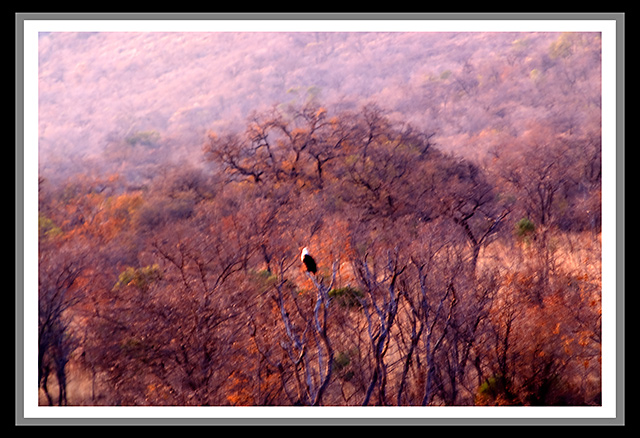
Cool shot but too out of focus. |
|
 Photographer found comment helpful. Photographer found comment helpful. |
|
|
10/07/2007 12:00:01 AM |
|
For me, your triple border almost makes it look like you took a photo of a photo on a wall. The outer thick black border detracts to em. Your image itself seems a little out of focus. Too bad you couldn't have gotten closer. |
|
| Photographer found comment helpful. |
|
|
10/06/2007 04:33:58 PM |
|
The border adds nothing to the photo IMHO and there appears to be a little camera shake. |
|
| Photographer found comment helpful. |
|
|
10/05/2007 03:05:04 PM |
|
| Photographer found comment helpful. |
|
|
10/05/2007 02:00:49 PM |
|
A bit blurred, but the colors are nice. The white of the eagles head contrasts nicely with the overall colors. |
|
| Photographer found comment helpful. |
|
|
10/05/2007 01:23:21 PM |
|
nice subject, but it looks shaky - 7 |
|
| Photographer found comment helpful. |
|
|
10/04/2007 02:32:51 AM |
|
Not a fan of the bordering, the colors are not complimentary to the photo and it really spoils it. This picture suffers by the size limitation and may have voted higher in a larger format. Could have been good one for impressionism challenge maybe. I like the painterly effect in it. Avg vote |
|
| Photographer found comment helpful. |
|
|
10/03/2007 07:54:59 PM |
|
like the colors, but the focus is off |
|
| Photographer found comment helpful. |
|
|
10/02/2007 07:11:49 PM |
|
This would be absolutely stunning - if it were in focus. |
|
| Photographer found comment helpful. |
|
|
10/02/2007 02:55:19 PM |
There are 3 things that would make this picture better:
1. The frame is to busy. No frame would make the picture larger and the eagle more visible.
2. Adding more sharpness with USM (//www.dpchallenge.com/tutorial.php?TUTORIAL_ID=4)
3. Adjust the colors. It has a red colorcast that can be reduced using Curves (//www.dpchallenge.com/tutorial.php?TUTORIAL_ID=24) |
|
| Photographer found comment helpful. |
|
|
10/02/2007 06:44:21 AM |
|
This has the feeling of a painting. I like the colours but am not sure about the overall image. |
|
| Photographer found comment helpful. |
|
|
10/01/2007 11:08:36 PM |
|
This is an interesting photo - is that an eagle in the middle? Since this is a fall photo, I'd like to see a better saturation of color, and also, it doesn't look like anything is in focus on the pic. For me, the border doesn't do anything but make the picture look smaller. |
|
| Photographer found comment helpful. |
|
|
10/01/2007 05:06:43 PM |
|
Oh dear. This looks like a great setting and a great opportunity but it also looks very out of focus and exposed incorrectly. |
|
| Photographer found comment helpful. |
|
|
10/01/2007 09:05:46 AM |
|
Great subject but can I see camera shake? |
|
| Photographer found comment helpful. |
|
|
10/01/2007 08:23:33 AM |
|
Oh man this is a rough one. I think there are just too many things not good about this image to list. The one I will mention though is the border. Really bad border. If you are interested in more of a critique please feel free to PM. |
|
| Photographer found comment helpful. |
|
|
10/01/2007 07:34:40 AM |
|
| Photographer found comment helpful. |
|
|
10/01/2007 07:06:40 AM |
This image seems to be suffering from lack of tripod. Unless your intent was to present a blurred image, and then I recant my suggestion - GRIN!
The extra frames don't really appeal or add to the quality of the image. |
|
| Photographer found comment helpful. |
Home -
Challenges -
Community -
League -
Photos -
Cameras -
Lenses -
Learn -
Help -
Terms of Use -
Privacy -
Top ^
DPChallenge, and website content and design, Copyright © 2001-2026 Challenging Technologies, LLC.
All digital photo copyrights belong to the photographers and may not be used without permission.
Current Server Time: 07/01/2026 07:12:07 AM EDT.