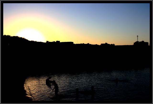
I agree with Annpatt, the re-edit is nicer, and I think it still totally qualifies as a silhouette. In fact, it is a little unique in that it has several separate silhouttes within the image: The skyline against the sunset, and the people in the water.
Also responding to your post mortem...On my work monitor, which is actually a little bright, 1/2 of the screen is pretty much totally black, except for a couple of blobs in the lower left.
Another issue is the sky. Where the sun is is completely blown out, and the rest of the sky has a lot of posterization. Posterization is usually caused by going too far with the curves. Or, now that I'm looking at your editing steps, posterization can be caused by using the brightness and contrast tools. Don't use brightness/contrast. Curves and levels can be used to adjust brightness and contrast, and are much less destructive to the image.
Your reedit is much better. The people become the subject in the reedit. In this one, the sun is the subject.
Thanks for all of the comments gained after the "Post Mortem" thread.
I will post my re-edit tonight when I go home in about 3 to 4 hours time... Here it is:
Here is the edit...
I think monitor calibration may be to blame here as there are actually 5 figures in the water, not 2 as yospiff commented on seeing!
The sun was meant to be the main focus of the image, the figures in the water are an added intrest in the composition as I see it. I didn't shoot it for the challenge, I was on holiday and wanted a sunset shot, this just managed to fit the "Silhouette" well with a bit of contrast/Brightness adjustment!
Responding to your post-mortem request more feedback on this:
I think the sunrise glow and the two small figures in the water are competing for attention here. The horizon is also right in the middle, and my view is not steered to either subject. All the details are on the left side of the image.
I'm going to go have a look at your other version that you said did not meet the challenge theme. (looks like you don't have it posted. I'd love to see it, if possible.)
It was only after examining the photo in detail I noticed the figures on the bottom left. I assume they are intended to be the main subject / focal point of this shot?
They're far too dark and don't really stand out enough. Also, there are a lot of artifacts along the skyline.
This shot really has a lot of possibilities - especially a great location and a neat horizon - but here are several areas that probably resulted in the low score. First, the silhouetted area appears to all run together, as if it is one blob of black. The viewer has to really look hard to see the people in the lower left. Second, the sky, with the strong digital artifacts - the layers of color bands - likely impacted your score. I noticed that one commenter really liked this, but in general most voters want smooth skies with rich colors.
I was one of your 7s. Unfortunately, I don't think many saw the figures in the water, which to me are a nice quiet surprise in this. Shots like this are also very dependent on viewers' monitors - in some instances, this may simply have been too dark. I suspect the advanced edit may have corrected that a bit. In short, this doesn't have the "snap" appeal that DPC votes high for, but it is a shot that I very much like.
The sun is beautiful with the three colours shining off it. My attention was drawen to the hot pixel just to the lower left of the sun. No big deal though.
The overall composition of the shot with the water in the forground is a nice touch. Well done.
I like the darkness of it... wow more I look at it the more I like it! I like the details of the roof of the houses, and the silhouttes of the kids playing in the water...







 Add photograph to your favorites
 Add photographer to your favorites


 Photographer found comment helpful.


