I'm flattered you chose my shot, and impressed with the result. CNovack gave you a great critque of it. I think you should be proud of the shot, and it looks like you have some awesome work in your portfolio.
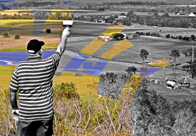
A good emulation off of the original. The difference is that this is a landscape scene that the painter paints rather than the seascape with boats scene. I like how you went with a paintbrush rather than a roller seen in the original. For me the paintbrush makes a stronger connection to the painter's of canvas paintings rather than a painter who does interiors or exteriors of walls. The landscape is a nice variation from the seaside scene we see in the original. However I think that the choice of scenery could have been more appealing visually. The foreground has scrub-brush bushes that in many areas have lost their foliage and are bare 'sticks'. Bushes with full greenery or various shades of greenery would add more visual appeal not to mention possibly add more color shades to the scene being painted. The colors of yellows on the rolling hillsides can be said to be 'fields of gold' but the color tones upon the water are an overly saturated blue almost purplish hue. Of course, the model and the photographer being the painter/creator of the picture I can almost hear you say "I'm the 'painter' of this composition and I can darn tootin' well choose the color tones I want to paint the scene:-)" That may be so, but for a greater audience appeal the colors should be not so oversaturated. I feel that they need to look more natural and richer in color tone variation for more visual appeal.







 Add photograph to your favorites
 Add photographer to your favorites


 Photographer found comment helpful.


