|
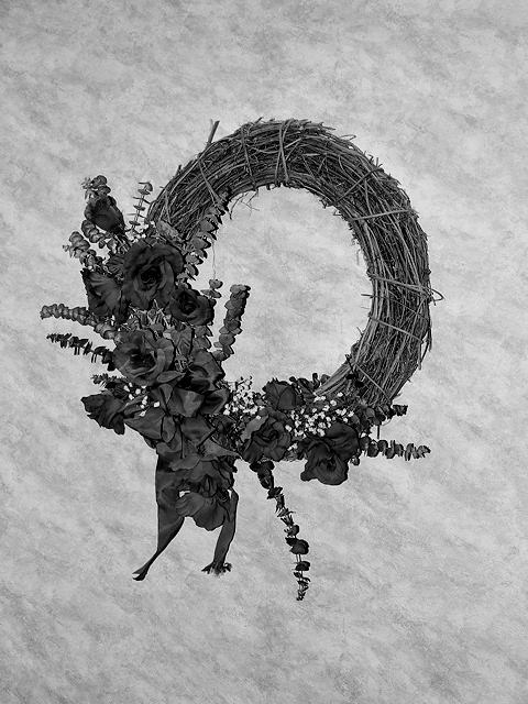
I think the contrast is dead on. This is much brighter than many of your posts and I have to say I like it a lot. The wallpaper texture makes a very nice background, though a tighter crop might give more play to the wreath itself. Lots of tiny details in there which would be even tastier if more prominent in the frame. |






 Add photograph to your favorites
 Add photographer to your favorites


 Photographer found comment helpful.