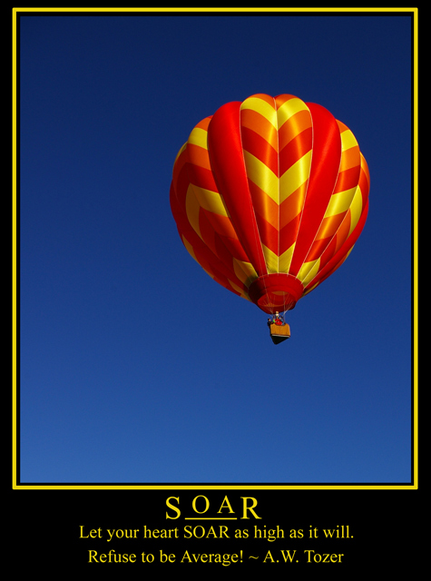
Nice photo in both. Just from a graphic perspective ... this is the better layout. With the type above and below (on the other piece) it sort of forms a centering process, keeping all the type below works better graphically ... and it is easier to read that way also.
Nice job on both. |




 Add photograph to your favorites
 Add photographer to your favorites


 Photographer found comment helpful.


