Author Thread
Post actions
aw, jeez, i wish i'd voted on this now. what a great and subtle shot. peons!
Post actions
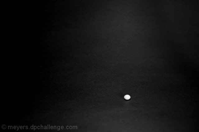
I thought this was a very well done photo. I love the two contrasting colors. Seems just a tad unsharp, but maybe it is my aging eyes. Simplicity works wonders and this is no exception. Personally, I think it is better than a big jar of candy.
Post actions
i like your non-traditional approach. this was one of the most interesting ones to me. :)
Post actions
:) How funky and minimalist. I'd say it's a very good piece of artwork. But, yeah, doesn't scream out candy, hence the score...
Post actions
I think people wanted to give me a negative score!
Post actions
Hey, I liked this one and gave it a 7. What's the matter with everyone, they don't like negative space???
Post actions
Rob: I gave this a 4. But that's specifically because it didn't say much to me about "candy." As a photo in general, or indeed as artwork, it's more interesting visually than that score. I like the white vs. black dichotomy, and the slight variation in the background is also good.
Comments Made During the Challenge
Post actions
Nice minimalist photo, mite do a bit better if it were a coloured candy but Im also a big fan of high contrast B&W images and photos. Nice :)
Post actions
Post actions
Post actions
Nice use of negative space in a minimalist picture, but I can't tell what it is and it isn't very appealing.
Post actions
Minimalistic, nice. But it doesn't catch much interest. I appreciate the idea, but I don't think it will fare so well...
Post actions
Wish the forgotten had a color.
Post actions
A bit too minimalistic for my personal tastes. The graininess of the background and the candy itself seems blown out.
Post actions
Post actions
this seems a little forced - the background does not provide any context to the theme and the 'treasure' seems oof
Post actions
perhaps a minimalist composition isn't the best choice for this challenge.
Post actions
i'm sure simple was the intent but this is just too simple
Post actions
I like the idea, and I sort of like the minimalist approach, but I think it's not quite selling it as it is.
Post actions
I love the simplicity of this shot. very nice.
Post actions
Lorem ipsum dolor sit amet, consectetuer adipiscing elit. Maecenas justo
Post actions
Love this one! It's hard to tell if it's a pill or a M&M though! Original, for sure.
Post actions






 Add photograph to your favorites
 Add photographer to your favorites

 Photographer found comment helpful.


