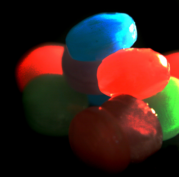
Unfortunatly I dont fully understand the "Warhead art" I tried googleing it but no such luck, sorry. To me the contrast and saturation are way to high technically speaking. It does look almost look like a comic illustration and if thats what you were going for then its IMO its pretty good :)
With better focus and less "gray grain" on some of the warheads (red one, back left and green one, right front), I would have scored this better. I do like your idea though.





 Add photograph to your favorites
 Add photographer to your favorites


 Photographer found comment helpful.

