| Author | Thread |
|
|
09/12/2007 09:46:03 AM |
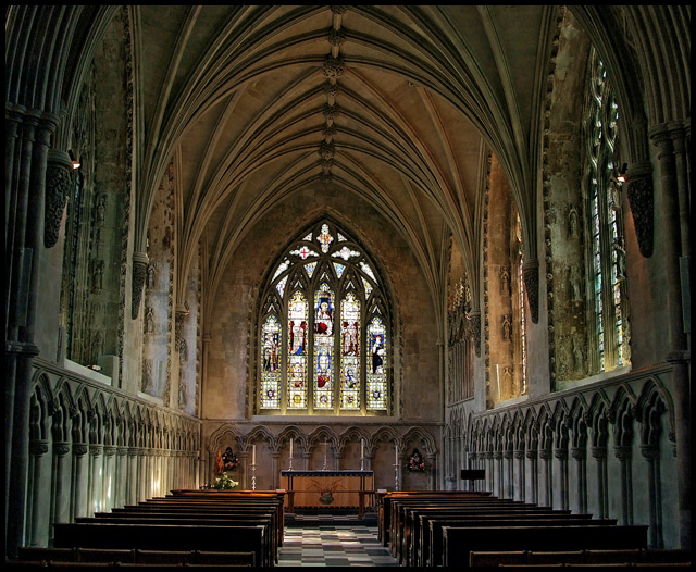
Hey MAK! Nice job! You have such an amazing versatile portfolio!
And I agree. . .the power of "the church" is unmistakable and awesome :)
|
|
 Photographer found comment helpful. Photographer found comment helpful. |
Comments Made During the Challenge  |
|
|
09/11/2007 11:32:24 PM |
|
very clear image and nice lighting, wish it wasn't slightly slanted |
|
| Photographer found comment helpful. |
|
|
09/11/2007 10:55:07 PM |
Now this church looks familiar....
Great symbolism, in this shot, I love the lighting and the post work is great. The only thing I would change is that it seems tilted to the left a bit. Great work. |
|
| Photographer found comment helpful. |
|
|
09/11/2007 08:51:12 AM |
|
beautiful cathedral. Looks a little lopsided tho. |
|
| Photographer found comment helpful. |
|
|
09/11/2007 01:42:31 AM |
|
I'm mixed on this picture. I love the lighting the on pews (not sure if thats spelled right) and the alter... but i don't really get the sense of beauty or inspiration from the window level up in the pic. I'd be curious to see what a crop around the alter area would look like from the original pic (maybe including the first couple pews) |
|
| Photographer found comment helpful. |
|
|
09/11/2007 01:07:34 AM |
|
Wow... if my church was as beautiful as this one, maybe i would go more often. Great photo. Lighting is right on the money...focus is pin point! (8) |
|
| Photographer found comment helpful. |
|
|
09/09/2007 05:31:29 PM |
|
I like the concept of this photo and the concrete adds to the power encased within the church walls, horizon is off a tad but still very nicely composed. |
|
| Photographer found comment helpful. |
|
|
09/09/2007 10:00:15 AM |
|
Beautifully captured. I would rotate slightly ccw to level. |
|
| Photographer found comment helpful. |
|
|
09/07/2007 09:30:08 PM |
|
At first I would've said that I didn't think this fit, but I think it does. I think what makes it work is all the lines going to the middle. It's a great image and it's really excellent composition. |
|
| Photographer found comment helpful. |
|
|
09/07/2007 06:22:46 PM |
|
Everything in this image is just splendid. :) Very nice! |
|
| Photographer found comment helpful. |
|
|
09/06/2007 09:07:36 AM |
|
this is a great shot, but its not horizontal. |
|
| Photographer found comment helpful. |
|
|
09/06/2007 01:49:15 AM |
|
nice, but a bit of center and crooked. |
|
| Photographer found comment helpful. |
|
|
09/05/2007 02:54:08 PM |
Not a bad church shot, though you are going to get slammed for not straightening it up!
Would have been nice if you were standing dead centre too as the symmetry is not quite there. If the church was empty, how come you managed to miss centre? |
|
| Photographer found comment helpful. |
|
|
09/05/2007 01:11:30 PM |
|
Beautiful Church! Very nice lighting. Your tripod wasn't quite level...slopes to the right. Good luck in the challenge. |
|
| Photographer found comment helpful. |
|
|
09/05/2007 11:42:27 AM |
|
beautiful shot, nice lighting..a little off center..dont know if that is the effect you wanted. overall great shot |
|
| Photographer found comment helpful. |
|
|
09/05/2007 11:03:17 AM |
|
Needs a slight straighten at bottom, but a beautiful photo. very serene. I like the graininess |
|
| Photographer found comment helpful. |
|
|
09/05/2007 09:52:12 AM |
|
Looks slightly tilted to me and that is a bit distracting. I do like the photo though, might be a bit of a stretch for this challenge. |
|
| Photographer found comment helpful. |
|
|
09/05/2007 04:41:42 AM |
|
Very nice.. Would have loved to see it totally symmetrical though. |
|
| Photographer found comment helpful. |
Home -
Challenges -
Community -
League -
Photos -
Cameras -
Lenses -
Learn -
Help -
Terms of Use -
Privacy -
Top ^
DPChallenge, and website content and design, Copyright © 2001-2026 Challenging Technologies, LLC.
All digital photo copyrights belong to the photographers and may not be used without permission.
Current Server Time: 06/28/2026 03:41:23 AM EDT.