| Author | Thread |
|
|
09/05/2007 03:56:42 AM |
|
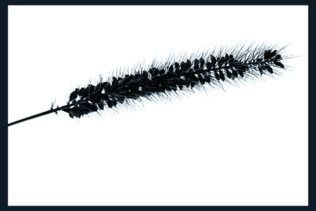
I like the angle and negative space. think the contrast is a bit too high. |
|
 Photographer found comment helpful. Photographer found comment helpful. |
|
|
09/04/2007 08:26:29 PM |
|
I like how the detailed shapes of the weed really stand out. The composition could maybe be a bit more diagonal. Still very interesting. I like it a lot. |
|
| Photographer found comment helpful. |
|
|
09/04/2007 07:12:42 PM |
|
I like the white background. Nice work. |
|
| Photographer found comment helpful. |
|
|
09/04/2007 06:05:08 PM |
|
It's interesting as it is. Minimalist in the extreme, but the contrast hooks me. |
|
| Photographer found comment helpful. |
Home -
Challenges -
Community -
League -
Photos -
Cameras -
Lenses -
Learn -
Help -
Terms of Use -
Privacy -
Top ^
DPChallenge, and website content and design, Copyright © 2001-2026 Challenging Technologies, LLC.
All digital photo copyrights belong to the photographers and may not be used without permission.
Current Server Time: 06/13/2026 08:29:01 AM EDT.