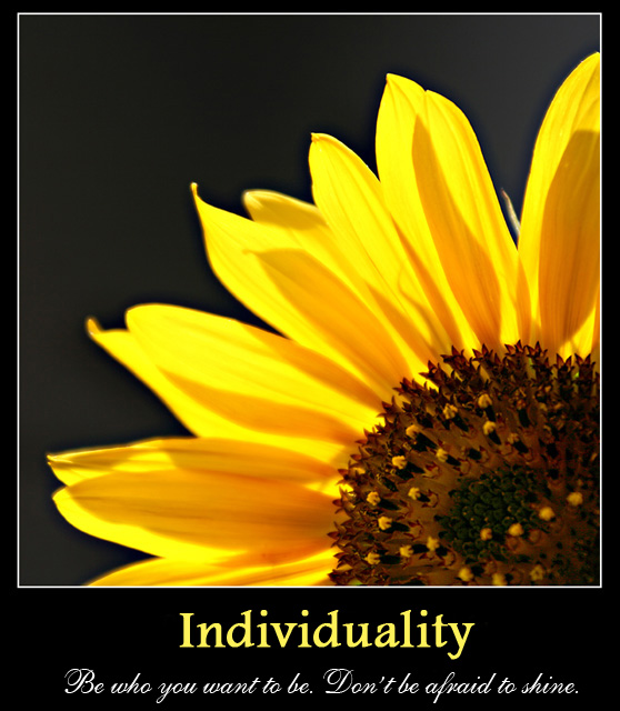
Brilliant backlighting on the flower petals, and I like your layout of the flower itself. It almost looks like flower on fire, which should have given it away as one of your shots. The font looks a little cluttered though; maybe an all caps "INDIVIDUALITY" and a simpler script font for the quote would have bumped this into the top 20.
well composed shot, petals could be a little sharper. nice lighting, though top right corner is a bit bright. white border is ok here. typeface of headline is somewhere in between, a classic typeface would have worked better, as would a modern sans-serif one; font color is a tad too bright. Handwriting font of subline works well again.





 Add photograph to your favorites
 Add photographer to your favorites

 Photographer found comment helpful.


