| Author | Thread |
Comments Made During the Challenge  |
|
|
02/08/2004 11:08:15 PM |
|
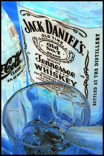
OmGOSH, you would ruin a good whiskey with that vile coke? LOL! Just kidding. I like the together idea but I don't like the post processing, the x-ray type look. The ice looks very dirty and just not very appealing at all to me. a 6 |
|
 Photographer found comment helpful. Photographer found comment helpful. |
|
|
02/07/2004 02:04:04 PM |
|
good compoaition can't say much for Jack Daniel through 6 |
|
| Photographer found comment helpful. |
|
|
02/05/2004 08:00:54 PM |
|
I hope you don't get to many "over processed" or "too PSed". I think you did a great job with this. The editing really works well. Crop and focus are great. I think this is my favorite so far. Good luck. |
|
| Photographer found comment helpful. |
|
|
02/05/2004 01:22:46 AM |
I don't appreciate the negative treatment of shots like this....Sorry
TC |
|
| Photographer found comment helpful. |
|
|
02/03/2004 05:46:07 PM |
|
The inverted color goes nice here..good job! |
|
| Photographer found comment helpful. |
|
|
02/03/2004 04:53:54 PM |
|
I would have preferred the original colors I think... yet I'm sure the voters would have considered it too 'dark'. |
|
| Photographer found comment helpful. |
|
|
02/03/2004 03:35:52 PM |
Well.. my two immediate reactions are "there's no reason for a negative effect on this shot" and "that really produces a cool effect."
So in the end, I think I've decided to take the shot as a purely visual experience and say that the unique subjects you had and the way they result from the effect made it a good choice, and the result is a very cool shot. |
|
| Photographer found comment helpful. |
|
|
02/03/2004 09:00:53 AM |
|
When I think whiskey and coke, I would expect to see warmer colors...reds, browns, etc. This negative image looks good, though I would expect this to be used for a vodka or some other clear drink. |
|
| Photographer found comment helpful. |
|
|
02/03/2004 03:36:18 AM |
hmm, I'm not much of a whiskey fan but isn't it best on the rocks - whiskey and ice? Very mystic blue color hope you tell us about the makeing of this picture.
What is it sticking into the picture from the lower right? Very nice setup. |
|
| Photographer found comment helpful. |
|
|
02/02/2004 08:07:50 PM |
|
not sure of the benefit of using the negative image here. |
|
| Photographer found comment helpful. |
|
|
02/02/2004 07:06:04 PM |
|
as one who drank Jack straight that seems a horrible combination |
|
| Photographer found comment helpful. |
|
|
02/02/2004 03:41:26 PM |
|
nice picture...would have been great the other way around (instead of negative). nice detail in the picture! |
|
| Photographer found comment helpful. |
|
|
02/02/2004 12:41:22 PM |
|
I like the blue colors but they look as if they've been post processed too much leaving dirty looking ice and glass and a black reflection of the whiskey bottle in the coke bottle. Plus, your colors look too blotchy. |
|
| Photographer found comment helpful. |
|
|
02/02/2004 12:40:09 PM |
|
The color shifting makes the bottles look all mottled and dirty and the drink unappetizing. Good combination, but the effect does not work for me. |
|
| Photographer found comment helpful. |
|
|
02/02/2004 01:35:25 AM |
|
Looks like an infrared filter was used here. Very creative and definitely out of the ordinary! It give the picture a spooky glow and I really like it! 10! It has good focus and all that other stuff, too. |
|
| Photographer found comment helpful. |
Home -
Challenges -
Community -
League -
Photos -
Cameras -
Lenses -
Learn -
Help -
Terms of Use -
Privacy -
Top ^
DPChallenge, and website content and design, Copyright © 2001-2026 Challenging Technologies, LLC.
All digital photo copyrights belong to the photographers and may not be used without permission.
Current Server Time: 07/01/2026 09:10:15 PM EDT.