| Author | Thread |
Comments Made During the Challenge  |
|
|
08/28/2007 01:20:37 AM |
|
I think this is quite classic ... a little more to the left side would have taken it off the centred feeling ... like the height of the table on the thirds line. |
|
|
|
08/27/2007 07:52:46 PM |
|
|
|
08/26/2007 09:38:06 PM |
|
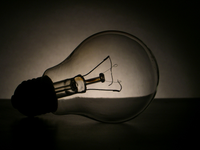
Awww. Poor bulb. Nice picture |
|
|
|
08/26/2007 08:25:09 PM |
|
Nice idea of using light to light something that is usually lit. (I think that is a tongue twister) |
|
|
|
08/25/2007 11:15:23 PM |
|
good contrast and sharpness |
|
|
|
08/24/2007 08:08:13 PM |
|
A little more backlight would have provided better detail |
|
|
|
08/24/2007 06:42:00 AM |
|
Nicely done, dig the tones in this low key shot. |
|
|
|
08/22/2007 10:48:48 PM |
|
I like the subtle message and the low key look. Only nitpick is the position of the line in the background. Perhaps a lower angle to make that line lower in the horizon, would've been less distracting. |
|
 Photographer found comment helpful. Photographer found comment helpful. |
|
|
08/22/2007 04:19:33 PM |
|
Simple yet stunning shot! |
|
|
|
08/22/2007 03:40:16 PM |
|
|
|
08/22/2007 12:23:10 PM |
|
Nice image - Nice clean sharp image. |
|
|
|
08/22/2007 11:10:18 AM |
|
|
|
08/22/2007 07:46:07 AM |
|
This is almost a silhouette. |
|
|
|
08/22/2007 01:42:48 AM |
|
Maybe you could have used more backlight for this? I think that might have looked better.. |
|
Home -
Challenges -
Community -
League -
Photos -
Cameras -
Lenses -
Learn -
Help -
Terms of Use -
Privacy -
Top ^
DPChallenge, and website content and design, Copyright © 2001-2026 Challenging Technologies, LLC.
All digital photo copyrights belong to the photographers and may not be used without permission.
Current Server Time: 06/29/2026 09:18:03 AM EDT.