| Author | Thread |
|
|
08/22/2007 08:43:26 PM |
|
hmm, I gave this a 9, I really like all the geometry and angles. well done IMO. :) |
|
Comments Made During the Challenge  |
|
|
08/21/2007 03:38:00 PM |
|
I like the shapes & colours, I think the shot could have been improved if the vertical lines were truly vertical (90 degrees). Good effort |
|
|
|
08/21/2007 01:56:28 PM |
|
Love the angles and the repeating patterns especially the triangles on the right border. |
|
|
|
08/19/2007 02:30:09 PM |
|
|
|
08/18/2007 07:42:26 PM |
|
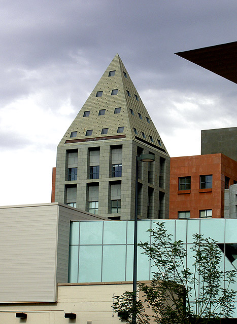
The building with the pyramid top is not parallel to the side of the photo (nor is the light post. I think this would have more impact if the main feature vertical was parallel to the side, and the other lines as they fit. Still, this is a nice shot. |
|
|
|
08/18/2007 05:30:04 AM |
|
Nicely seen - I especially like the dark angle sticking it's head into the shot. |
|
|
|
08/17/2007 08:57:32 PM |
|
almost has an optical illusion feel to it...leaning right,was that on purpose? Oblio (of Harry Nilssons' "The Point") works there,thats the way they wanted it...thats the way its going to stay... i like it |
|
|
|
08/17/2007 12:37:47 PM |
|
Having the picture skewed a little clockwise detracts, I think, from an otherwise succesful compostion. The dark triangle in the upper right hand corner is also distracting. Perhaps you could have set up just a bit more to your left? |
|
|
|
08/16/2007 09:57:47 PM |
|
seems a bit tilted to the right and the black triangle at the top right is distarcting, but otherwise neat photo |
|
|
|
08/16/2007 03:43:06 AM |
|
Needs some straightening I think. I am not sure what to think of the black triangle jutting into the frame in the top right. The lamp post also seems to somewhat blend in so I am left sort of wondering what it is. A bit more contrast would add a bit of punch to the sky which already looks pretty good. Interesting subject and the title suits it well. |
|
Home -
Challenges -
Community -
League -
Photos -
Cameras -
Lenses -
Learn -
Help -
Terms of Use -
Privacy -
Top ^
DPChallenge, and website content and design, Copyright © 2001-2026 Challenging Technologies, LLC.
All digital photo copyrights belong to the photographers and may not be used without permission.
Current Server Time: 06/30/2026 11:34:47 AM EDT.