| Author | Thread |
Comments Made During the Challenge  |
|
|
08/19/2007 12:38:10 PM |
|
beautiful color, simple, elegant |
|
|
|
08/19/2007 10:25:20 AM |
|
|
|
08/17/2007 06:23:04 PM |
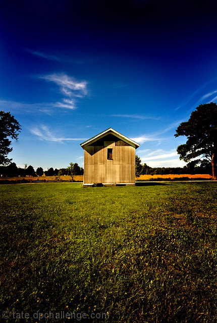
Your shot is too centered. This can work for some subjects but it doesn't do anything for this shot. If you crop out part of the sky or part of the grass, it is a bit more potent. Moving the building to one of spots in the frame where your third lines cross would be even better.
TC |
|
|
|
08/14/2007 10:35:44 PM |
|
I think you could have cropped off some of the foreground, uncentered the focal point. |
|
|
|
08/14/2007 08:28:06 PM |
|
too... much... vignette.... can't.... take it.... |
|
|
|
08/14/2007 09:46:50 AM |
|
I think this image could be much stronger if the subject were not in the very center and the horizon line across the middle. |
|
|
|
08/13/2007 02:13:57 PM |
|
|
|
08/13/2007 09:18:30 AM |
|
|
|
08/13/2007 05:05:04 AM |
|
beautiful depth in the sky... |
|
Home -
Challenges -
Community -
League -
Photos -
Cameras -
Lenses -
Learn -
Help -
Terms of Use -
Privacy -
Top ^
DPChallenge, and website content and design, Copyright © 2001-2026 Challenging Technologies, LLC.
All digital photo copyrights belong to the photographers and may not be used without permission.
Current Server Time: 06/29/2026 11:22:41 AM EDT.