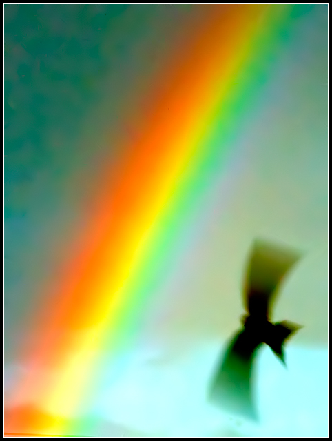
This is a heavily cropped and processed shot that I took while trying to capture a rainbow (at one point a double rainbow). I need to post a series of these here (unprocessed) and ask what I did wrong, because they're awful. This one, however, with the bird (swallows were everywhere that evening), I like for this side challenge. It's likely the only shot I had that I'll use for this challenge (all others were/will be done specifically for it).
Processing:
In camera raw, auto settings as shot
Saved to psd
Neat image
Heavy levels
Cloned out extra bird specs
Neat image
Resize
Border
Save for web
This contrasts nicely with some other photos I've looked at. For one thing, it is confessed to be an accident. The "art" here was the art of selecting the right accident, cropping it to the size and shape it wants to be, and then processing it. This is a valid and common way for an artist to balance the left and right brain, the ego and the id, the conscious and the unconscious.
Next, in contrast to Jeffrey above, blur in this case makes the symbols *more* symbolic. It is impossible to think of the bird as one particular bird. The rainbow, too, is impossible to think of as the weather condition of a particular day in a particular photographer's life. The viewer is forced to look at these subjects as symbols, and to an extent viewers like seeing such an authoritative stance from the artist. It's like reading a novel by Dickens, an authoritative narrator.
The danger, though, is that the image will be too simple. It will be too obvious what I should think. But the obvious message that normally would resonate from these symbols is missing, and that would be the message of aspiration and progress. This image is not a corporate success poster.
How did Rob avoid that? Well, for one thing, the bird is practically sideways, not soaring upward. Also, the composition is cramped. The bird actually seems trapped by the rainbow. The rainbow itself has more personality than you normally expect from a rainbow. It's a little crabby, looks a bit neon and brittle. For me, the image represents a frank look at change, how it forces transcendence but at a painful price. For you, it might be different. But that room for interpretation is NOT an accident. It was built in by the artist.
WOW, that is a gorgeous shot. So ... I don't the right word. Evocative? Provocative? It takes the mystery of a rainbow, where no matter how strong it is, it's just still a little too dim to see clearly, and turns into a brilliant streak daring you not to look. And that bird! It could be anything, from a random wanderer to a minion of hell come to take all the color out of the world.
Of the three posted in the thread, this is the ONLY one for me. Great diagonal line and the spread of the bird's sing is on the exactly same plane, in parallel, with the Rainbow. Very cool. I like the intensity of it. Well done.
Well, you know how it goes where you take a hundred shots for the one good one -- I haven't seen the ones you think are awful -- but I'd say they were all worth it for this one! I love photographing birds in flight, so I have such an appreciation for photos that capture the bird with his wings spread just right so that the bird looks majestic and beautiful (rather than a blob you almost can't tell what it is).
And that rainbow!! Wow! Wow! Wow! Whatever you may have done wrong with the others, I think you did everything juuuuuuuust right on this one!




 Add photograph to your favorites
 Add photographer to your favorites


 Photographer found comment helpful.


