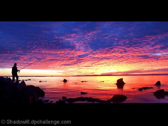
Thanks for all of the votes and comments. The decision to crop the photo like this was a hard one, and due to the number of comments that suggested that the pano style borders were wrong I think perhaps it wasnt the best way to go. I had it at 800 wide as it was going to go in the free study untill I realised it could fit here.
I had this
as My submission until I went to print it and thought the balck made it stand out more.
Here is the full image.
Looking at it now Im still not sure that it was the best thing to do to crop it :)
Statistics
Place: 16 out of 211 Avg (all users): 6.4658 Avg (commenters): 8.1429 Avg (participants): 6.4098 Avg (non-participants): 6.5059 Views since voting: 1719 Views during voting: 234 Votes: 146 Comments: 8 Favorites: 0
nice composition, though would like a little less foreground and more sky. needs slight rotation. border is too thick as well. good use of shadow and contrast





 Add photograph to your favorites
 Add photographer to your favorites


 Photographer found comment helpful.


