So here's how it was done:
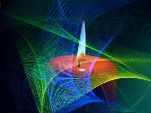
This is actually a picture of my computer monitor, the abstract light is from the "Mystify" screen saver. I timed it so about the first second of the exposure was from the candle on my desktop and the last 7-8 seconds were of the screen saver. I tweaked the colors used in the screen saver until I found an effect that I liked. The fading of the colors toward the top was accomplished by using a circular polarizing filter and tilting my LCD monitor back slightly (LCD monitors emit polarized light), and adjusting the polarizer until the the bottom of the monitor was brightest through the polarizer.
Adjustments: The contrast was increased as well as the Blue and Green saturation. Levels were decreased for the midtones and highlights.
Statistics
Place: 56 out of 120 Avg (all users): 5.3523 Avg (commenters): 6.2500 Avg (participants): 4.8193 Avg (non-participants): 5.7545 Views since voting: 2330 Votes: 193 Comments: 15 Favorites: 3 (view)
I like the contrasting colors (I'm color crazy). Your title may be a bit too correct though. The candle actually looks faded behind all those lines. Was this a monitor shot with the candle reflected?
Lots of lovely colors in this one. They harmonize beautifully. My personal preference would have been to crop the left side a tad more, but you're the one who did the terrific work!






 Add photograph to your favorites
 Add photographer to your favorites


