| Author | Thread |
Comments Made During the Challenge  |
|
|
07/23/2007 11:10:45 PM |
|
I can't choose, I can't choose, too much pressure. AGH! |
|
 Photographer found comment helpful. Photographer found comment helpful. |
|
|
07/23/2007 11:01:23 AM |
|
Very creative... looks good |
|
| Photographer found comment helpful. |
|
|
07/23/2007 03:24:21 AM |
|
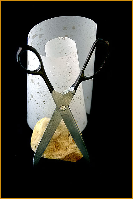
excellent take on rock, paper, scissors...would make a fantastic stock image |
|
| Photographer found comment helpful. |
|
|
07/22/2007 10:44:01 PM |
|
That almost looks like a face! Nice entry to the challenge. |
|
| Photographer found comment helpful. |
|
|
07/22/2007 01:34:04 AM |
|
i like this...great idea ;-) 9 |
|
| Photographer found comment helpful. |
|
|
07/21/2007 10:05:35 PM |
|
Clever idea....don't love the staging and scissor handles disappear in background. |
|
| Photographer found comment helpful. |
|
|
07/20/2007 06:17:32 PM |
|
Nice composition and lighting. The handles on the scissors get a little lost with the background, but otherwise well done. Good luck in the challenge. |
|
| Photographer found comment helpful. |
|
|
07/20/2007 12:33:54 PM |
|
I always go with Rock, but I guess paper is ok here. Nicely done. |
|
| Photographer found comment helpful. |
|
|
07/20/2007 06:07:33 AM |
|
I'm not sure about the border, and I don't understand the title, but it's a nice shot. I like the crisp detail throughout. |
|
| Photographer found comment helpful. |
|
|
07/19/2007 05:25:11 PM |
|
i am ashamed to say i dont get it but well done 7 |
|
| Photographer found comment helpful. |
|
|
07/19/2007 04:10:22 PM |
|
| Photographer found comment helpful. |
|
|
07/18/2007 03:13:45 PM |
|
I like the consept, good idea. My only complaint and it's just me being picky...whole image should've been more centered, I can see a bigger gap to the right side. Still great! 8 |
|
| Photographer found comment helpful. |
|
|
07/18/2007 02:03:26 PM |
|
The focus should be on paper. |
|
|
|
07/18/2007 01:02:46 PM |
|
classic! as photo so so. the scissors are a bit hide, the paper is on the background. I don't like the composition, a better photo was possible with the same elements. |
|
|
|
07/18/2007 04:42:14 AM |
|
a centered composition would work fine here, but it is a little off to left and bottom, very good lighting and color. a tad oversharpened. border distracts, had chosen a white one. |
|
| Photographer found comment helpful. |
|
|
07/18/2007 12:27:22 AM |
|
Hmm, im not sure what this is about. i dont get the relation between sisscors, rock, or what appears to be paper. ? |
|
Home -
Challenges -
Community -
League -
Photos -
Cameras -
Lenses -
Learn -
Help -
Terms of Use -
Privacy -
Top ^
DPChallenge, and website content and design, Copyright © 2001-2026 Challenging Technologies, LLC.
All digital photo copyrights belong to the photographers and may not be used without permission.
Current Server Time: 06/28/2026 10:38:03 AM EDT.