| Author | Thread |
Comments Made During the Challenge  |
|
|
07/21/2007 02:00:44 AM |
|
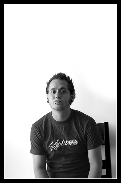
I'd recommend cropping off the top and maybe some of the left side. |
|
 Photographer found comment helpful. Photographer found comment helpful. |
|
|
07/19/2007 01:40:06 PM |
|
a bit too much negative space in the top |
|
| Photographer found comment helpful. |
|
|
07/18/2007 10:19:31 PM |
i like the blank space.
-josh |
|
| Photographer found comment helpful. |
|
|
07/18/2007 02:31:38 PM |
|
I like the off-balanced-ness of the composition and the bw works well to make it an even simpler, but effective shot. |
|
| Photographer found comment helpful. |
|
|
07/18/2007 03:05:52 AM |
I really like This Photo...
I like how the guy isn't in the center of the page, but he is still the main focus,
i also like how he is wearing dark colours, and the background is white.
the lighting is really good...
Good Job |
|
| Photographer found comment helpful. |
|
|
07/18/2007 02:53:41 AM |
|
| Photographer found comment helpful. |
Home -
Challenges -
Community -
League -
Photos -
Cameras -
Lenses -
Learn -
Help -
Terms of Use -
Privacy -
Top ^
DPChallenge, and website content and design, Copyright © 2001-2026 Challenging Technologies, LLC.
All digital photo copyrights belong to the photographers and may not be used without permission.
Current Server Time: 06/30/2026 09:06:22 AM EDT.