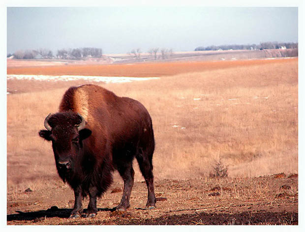
This was taken at my Dad's farm, he started raising buffalo a couple of years ago, he took me out into the pasture in the car and I took these out the window, they were only standing a few feet away, these animals are so massive and quite intimidating standing that close as they grunt and steam is blowing out of there huge nostrils lol.
Resized, cloned out some straw hanging on his face, adjusted brigtness and contrast, color saturation, ran through neat image, sharpened and added border.
I am happy with the outcoming but that usually means it will do horribly here lol, I am hoping for atleast a 5.5...but I guess we'll see.
Statistics
Place: 59 out of 124 Avg (all users): 5.9245 Avg (commenters): 6.2143 Avg (participants): 5.5930 Avg (non-participants): 6.1508 Views since voting: 1674 Votes: 212 Comments: 18 Favorites: 0
Shannon, this is an awesome picture! I love the 3 dimensional feeling here. There is a definate sense of depth. The neutral color scheme works very well also. The earthy tones of the soil and grasses go well with the tones of the animal itself.
Under ideal circumstances, there are a couple of things that might have made this shot even more potent. This includes framing the shot so the animal is looking into the frame instead of out of it. I would LOVE to see more detail in the animals fur especially in the face areas. None of these things really detracts from the shot, but would maybe add to it...
Dont like the framing on this. I think he should've been facing the open side, putting him on the opposite side of the frame. Bison is a little underexposed and the sky is a pretty dreary color too. Idea for the shot is good, just need to clear up a few details and this would really improve. 6
Great earthy colours and nice background too.
I would have placed the Bisson more on the right, so that it is directed into the image rather then outside of it.
i dislike the border here, but i rarely take points away for that. very desolate looking with one bison, which i think is what makes this picture strong.
In cases like this I (for my own photos) like to have the animal on the right side of the picture so that it doesn't look as if the animal is heading out of the frame... but this is personal preference...
You'll probably get this comment from several people but I'll say it anyway. I think this would have looked even better if the bison was facing into the picture space. Still, an impressive photo and I could, indeed, see this as appearing in NG.
Hi S :) Another great shot of Nebraska and these beautiful Bison! I love these creatures, especially thieir colors.
Your horizon is a bit slanted and I don't like the way you've positioned the animal in the frame. First, his/her head gets lost in the rest of it's body and it's dark there, so it's even harder to see detail there. Secondly, I would prefer to see it facing in towards the center of the frame, rather than out, as you have it.
Glad you decided not to use a narrow DOF as I like to see the environment the animal is in. Also, something seems strange with the exposure, as the bison is too dark and in places, and exposed right in others, and your background is washed out looking. Plus, there seems to be a glare coming from center top.







 Add photograph to your favorites
 Add photographer to your favorites


 Photographer found comment helpful.


