| Author | Thread |
|
|
09/17/2002 04:23:00 PM |
|
I voted this a 7. My you forgot the "e" comment was a joke about Dan Quayle. |
|
|
|
09/16/2002 11:18:00 AM |
|
didnt get to comment but i liked the imagination on this |
|
Comments Made During the Challenge  |
|
|
09/15/2002 04:04:00 AM |
|
poor guy never had a chance - 7 |
|
|
|
09/14/2002 08:58:00 PM |
Composition: Subject Placement, Cropping, Background6,
Technical: Focus, Exposure, Lighting, Processing6,
Appeal: Is it Interesting, Motivating, Etc.? 3,
Total Averaged Rating5. Autool
|
|
|
|
09/14/2002 08:06:00 PM |
|
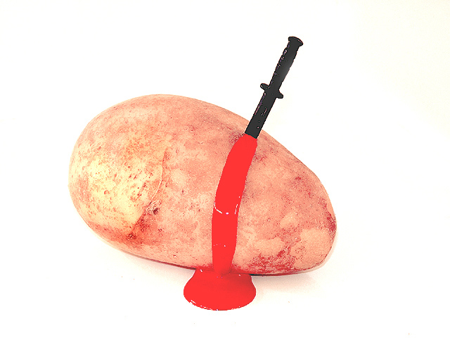
Was it Professor Plum or Colonel Mustard? |
|
|
|
09/14/2002 08:04:00 PM |
|
Ok it's well shot but the subject turns me off. |
|
|
|
09/14/2002 03:07:00 PM |
|
Clever. Wouldn't ketchup been more suitable? |
|
|
|
09/14/2002 11:28:00 AM |
|
Unique and original. Well done! Good luck in the callenge. Gracious aka Grayce |
|
|
|
09/14/2002 09:54:00 AM |
|
|
|
09/13/2002 05:44:00 PM |
|
|
|
09/13/2002 05:21:00 PM |
|
I'm not sure what to think aobut this photograph. The subject looks like it is floating, also the background washes out the potato. |
|
|
|
09/13/2002 04:12:00 PM |
|
LOL that's great. Is Mrs. Potato Head next on the list? |
|
|
|
09/13/2002 01:33:00 PM |
|
Took me a minute to get the title! The red is really bright, so that causes the picture to jump out. I think a little more detail on the knife would be good. karmat |
|
|
|
09/13/2002 05:06:00 AM |
Nice clean white background. "Blood" colour just a little tooo far away from realistic. Good that it's an original title/ idea - just not my cup of tea.
Kavey |
|
|
|
09/12/2002 11:34:00 PM |
|
|
|
09/12/2002 03:54:00 PM |
|
good to see not all humor was lost while i was gone. |
|
|
|
09/11/2002 07:09:00 PM |
|
|
|
09/11/2002 06:37:00 PM |
|
|
|
09/11/2002 10:48:00 AM |
|
|
|
09/11/2002 12:40:00 AM |
|
Interesting and disturbing. |
|
|
|
09/10/2002 11:16:00 PM |
|
|
|
09/10/2002 08:59:00 PM |
|
Concept is good however blood spreads in all directions. You could have hed a much better composition had the blood flow been more realistic. But good go. I like the concept. |
|
|
|
09/10/2002 05:36:00 PM |
|
Ugh...I think it's pretty gross. Misses the mark on being funny (or my funny photo detector is a bit off today). Red color is badly clipped (or has been painted in and lost detail), knife looks pretty photoshopped (a no-no on this site!). Sorry...this truly is one dead potato. |
|
|
|
09/10/2002 08:45:00 AM |
|
just couldn't rise to the challenge? Visually dull subject just barely made more interesting by fake violence. Lighting off. |
|
|
|
09/09/2002 10:38:00 PM |
i never knew potatoes bled.
wow i've got to try that |
|
|
|
09/09/2002 08:27:00 PM |
|
It lacks depth and looks too one-dimensional for me. |
|
|
|
09/09/2002 05:37:00 PM |
|
this made me laugh out loud. |
|
|
|
09/09/2002 03:08:00 PM |
|
ouch. lol. nice play on words in the title, nice white background. 'blood' doesn't look very convincing, it is too light, and i wonder why you used such a small knife. what is that anyway? almost looks like a cardboard cutout? i'm sure that was deliberate, but i think i would've preferred a real knife. -- gr8photos (5) |
|
|
|
09/09/2002 01:56:00 PM |
congrats for daring to do something different. the shot it's a bit bright but interesting never the less...
|
|
|
|
09/09/2002 09:54:00 AM |
|
Home -
Challenges -
Community -
League -
Photos -
Cameras -
Lenses -
Learn -
Help -
Terms of Use -
Privacy -
Top ^
DPChallenge, and website content and design, Copyright © 2001-2026 Challenging Technologies, LLC.
All digital photo copyrights belong to the photographers and may not be used without permission.
Current Server Time: 06/28/2026 08:56:42 PM EDT.