This looks like a lot of noise and banding in the sky on this one. That or the sky is suffering from some overprocessing. Colors are interesting in the sky. I think this might be a little overexposed for my tastes tho.
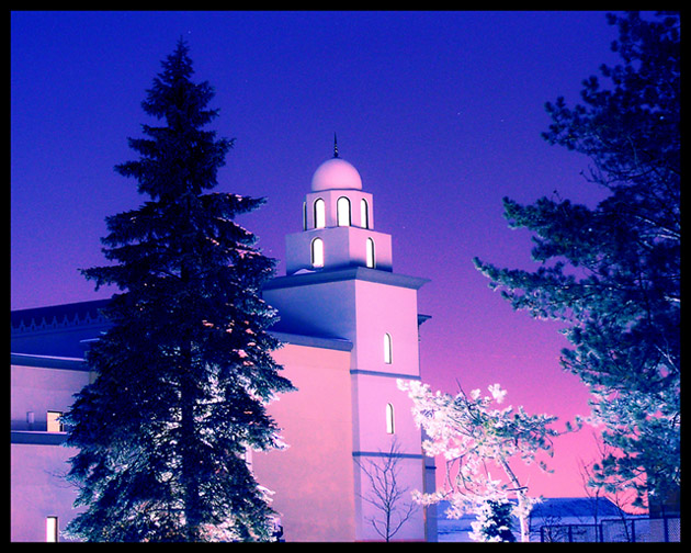
The sharp lines of the mosque and the pink coloring make this look more like a painting than a photograph. Very nice effect. The trees provide a nice contrast to those severe lines.
Very interesting shot! My favorite light is on that little tower/turret. Below seems a little bright. I like the tree on the left. Have you experimented with your composition to put that turret on a "third"? It may make the composition a bit stronger. Nice blue colors!
I'm not sure if this is IR or just post processing. The top of the mosque looks good, the color seems to fit and contrasts nicely against the blue. Also fairly sharp. Unfortunately it's the lower part of the photograph I'm not too fond of. The tree on the left looks like it's been badly masked with the pink at the top and the white through the branches. The middle tree has an unnatural-looking hue, and the pink in the sky surrounding that tree also seems quite unnatural. It may have appeal to some people, but it just looks odd to me, sorry.





 Add photograph to your favorites
 Add photographer to your favorites


 Photographer found comment helpful.


