|
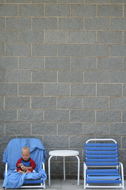
when you add that much negative space, there should be a reason for it. While the boy is cute and the bottom quarter of the image is well taken, the top half adds absolutely nothing. If there had been something of interest, I could understand why it wasn't cropped out. Really like the use of red on the child to make him stand out. |






 Add photograph to your favorites
 Add photographer to your favorites


 Photographer found comment helpful.


