| Author | Thread |
|
|
07/03/2007 04:39:22 PM |
Greetings from the critique club,
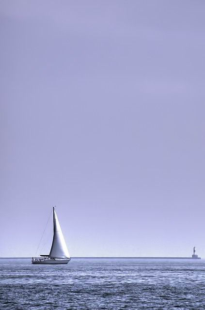
Didn't do to many critiques the last few months, but was glad this image popped up.
It's a happy picture, with good use of negative space.
I dont know excactly why this didnt go any higher then 59 place, but sometimes you just dont know @ dpc.
A little more contrast maybe would have worked and maybe the lighthouse would be a bit distracting for some people.
But overall I think this is a strong picture.
If you have any questions contact me via PM |
|
 Photographer found comment helpful. Photographer found comment helpful. |
Comments Made During the Challenge  |
|
|
06/26/2007 04:38:18 PM |
|
This is awesome! One of my favorites out of this challenge with so many great pictures |
|
| Photographer found comment helpful. |
|
|
06/26/2007 09:59:15 AM |
|
This is BEAUTIFUL! This is exactly what comes to my mind when I think of the perfect Negative Space photo. The cool blues make it especially appealing to me! This is my favorite one so far. |
|
| Photographer found comment helpful. |
|
|
06/26/2007 06:34:18 AM |
|
Lovely tones and light here. You have produced an excellent photograph. Well done. |
|
| Photographer found comment helpful. |
|
|
06/26/2007 05:02:46 AM |
|
Try bumping contrast a little to minimize the haziness. nice use of neg space. |
|
| Photographer found comment helpful. |
|
|
06/25/2007 06:47:55 PM |
|
| Photographer found comment helpful. |
|
|
06/25/2007 06:07:41 PM |
imo the lighthouse really doesn't add too much and takes away from the negative space
6
Jack |
|
| Photographer found comment helpful. |
|
|
06/25/2007 02:57:58 PM |
|
Sometimes too much negative space doesn't work. I think that this would have been a better picture if cropped about halfway up. |
|
| Photographer found comment helpful. |
|
|
06/23/2007 11:11:16 AM |
|
What a pretty color choice. Great aspect and nice use of neg. space. You kept enough of the foreground to not lose sight of the subject matter. Some have struggled with that issue in this challenge. |
|
| Photographer found comment helpful. |
|
|
06/21/2007 07:59:02 PM |
|
well, there's some hints of negative space in the way things cut into the sky, but having so much sky up top obliterates this sense. |
|
| Photographer found comment helpful. |
|
|
06/21/2007 02:24:10 AM |
|
| Photographer found comment helpful. |
|
|
06/20/2007 06:11:51 PM |
|
If this is a duotone or colour, it really works with the overall tinge of blue. I like that there is something off to the right, and not the typical single subject with space all around. Pretty!! |
|
| Photographer found comment helpful. |
|
|
06/20/2007 06:02:54 PM |
|
Lovely shot. The lighthouse at the end of the breakwater adds a lot to this image, as does the soft bluish-purple color presentation. |
|
| Photographer found comment helpful. |
|
|
06/20/2007 11:18:12 AM |
|
Makes me wish I was at the ocean. |
|
| Photographer found comment helpful. |
Home -
Challenges -
Community -
League -
Photos -
Cameras -
Lenses -
Learn -
Help -
Terms of Use -
Privacy -
Top ^
DPChallenge, and website content and design, Copyright © 2001-2026 Challenging Technologies, LLC.
All digital photo copyrights belong to the photographers and may not be used without permission.
Current Server Time: 06/30/2026 09:44:58 PM EDT.