| Author | Thread |
|
|
06/27/2007 04:51:13 PM |
|
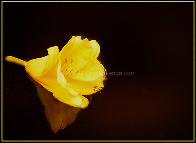
To me the negative space is the bit of reflection underneath - adds a nice touch to this. I'll agree with Jutilda on the yellow of the border - just a hair too big for a delicate image like this. |
|
 Photographer found comment helpful. Photographer found comment helpful. |
Comments Made During the Challenge  |
|
|
06/25/2007 08:24:42 PM |
|
oversharpened and still not clear enough. |
|
| Photographer found comment helpful. |
|
|
06/24/2007 04:33:57 PM |
|
| Photographer found comment helpful. |
|
|
06/20/2007 09:17:28 AM |
|
I think the yellow in the frame really detracts from the bloom. If you do it at all, I'd make it ultra thin and back off the opacity of the colour so that it just gives the eye a hint of yellow and not a blaring line. The reflective quality of the flower is pretty - it's almost as if it's floating on a sea of chocolate. The lighting seems a touch harsh. It's so hard to get details on yellow and red flowers. Too bad you couldn't use the burn tool. I hate basic editing. ;~D |
|
| Photographer found comment helpful. |
Home -
Challenges -
Community -
League -
Photos -
Cameras -
Lenses -
Learn -
Help -
Terms of Use -
Privacy -
Top ^
DPChallenge, and website content and design, Copyright © 2001-2026 Challenging Technologies, LLC.
All digital photo copyrights belong to the photographers and may not be used without permission.
Current Server Time: 06/28/2026 05:35:35 PM EDT.