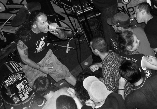
Perhaps DPCers haven't attended an event quite like this one; I have. Many times, in fact. This picture captures what's there really well, and from an interesting perspective. Composition works well for me, the placement of the singer especially so. The other people don't bother me; in fact, it would be weirder for me without them. That one is going (or being talked to, or whatever) also doesn't distract me. For me, it's all part of the scene, and the chaotic energy of it really works to bring me back into that "kind" of scene, scenes which are always moving. I think this image would get that kind of polar response, on one end from those who experience it, and on the other from those who see it (both are valid, they're just different perspectives which might help to explain your score). My longest comment ever, I think :)
I find that the lines of the singer's body lead you to the girl exiting on the right, and all the energy just sorta seems to flow out of the pic via her...and though I don't mind tilting horizons most dpcers seem to have an aversion to them. Still a good try.
My guess about the score is along the lines with what Raish said. I'm guessing that many voters thought you had "shoehorned" a shot in to the Pure challenge by putting "Pure" in the title. They probably would not have had any notion of "pure" if they looked at the shot without the title.
BTW the thing that keeps grabbing my attention is the girl on the right who is looking back with that other hand on her arm. There seems to be more going on there than in the rest of the picture. If that is not your focal point, you might want to crop her out.
Nice bell curve. One one and one ten. Do you think we could introduce them to each other?
Good dynamics with the tilt. Maybe if the singer was somehow more distinct from his immediate background it might help.
I think the 4.7 has something to do with 'pure' being seen as synonymous with 'virtuous' - which means all bets are off for some of us anyway :)
I'm guessing the score came from a lack of contrast and a lack of WOW! factor. The angle's definitely interesting and fits the subject. But the heads of the audience kind of blend into the background.
I know it was basic editing, but I wonder how it would look if you darkened the background stuff and lightened their heads.
IMHO I'd prefer a tighter crop on the singer. He's got a great expression that matches your title, but then you have the girl in the crowd turning away. For some reason my eyes to that side and she doesn't seem "into" the scene.







 Add photograph to your favorites
 Add photographer to your favorites


 Photographer found comment helpful.


