| Author | Thread |
Comments Made During the Challenge  |
|
|
06/19/2007 10:37:44 PM |
|
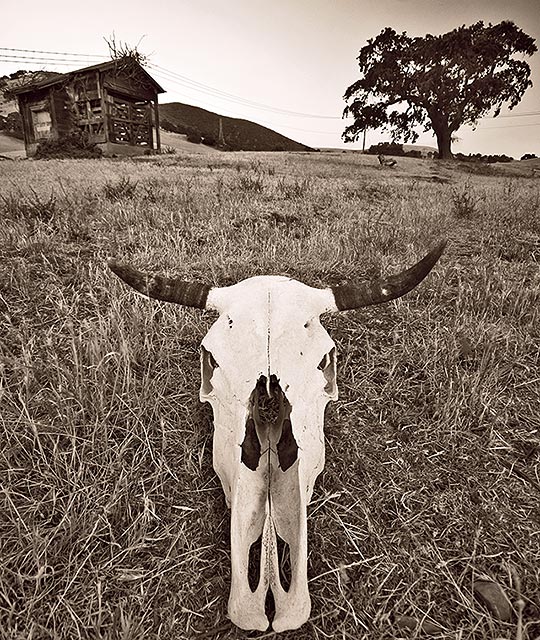
This is a real fun image. I would like to see the results if you increased the contrast just a touch. Just a personal preference. |
|
 Photographer found comment helpful. Photographer found comment helpful. |
|
|
06/18/2007 03:53:48 PM |
|
I like the angle and colour, but I can't decide if the horizon adds much to the picture. |
|
| Photographer found comment helpful. |
|
|
06/18/2007 03:05:40 PM |
|
i feel that this would have worked better if the subject(the skull) were in its natural state(mabe found half buried),seems a bit to set-up,good idea tho,also could crop out the top a lil to get rid of power lines |
|
| Photographer found comment helpful. |
|
|
06/17/2007 10:54:49 PM |
|
A bit contrived but I like the sepia and sense of nostalgia. |
|
| Photographer found comment helpful. |
|
|
06/16/2007 11:17:30 PM |
|
What a great image! I love the entire thing. |
|
| Photographer found comment helpful. |
|
|
06/16/2007 02:41:25 PM |
|
Perhaps the skull is a bit too centered IMO, maybe an angle might make it more balanced? |
|
| Photographer found comment helpful. |
|
|
06/15/2007 10:10:02 PM |
|
Dead center composition not the best. |
|
| Photographer found comment helpful. |
|
|
06/15/2007 02:47:13 PM |
|
I don't like the skull being centered so much. I think it would have looked better in the bottom right turning in to the photograph. |
|
| Photographer found comment helpful. |
|
|
06/15/2007 12:18:39 AM |
|
talk about tight crop! I like it tho, nice triangular comp |
|
| Photographer found comment helpful. |
|
|
06/14/2007 12:56:50 PM |
|
nice color tone here but i think the skull is too close to the bottom edge. |
|
| Photographer found comment helpful. |
|
|
06/14/2007 08:56:21 AM |
|
What a cool picture! I like the tone you picked makes it look antique-ish. |
|
| Photographer found comment helpful. |
|
|
06/14/2007 01:47:50 AM |
|
| Photographer found comment helpful. |
Home -
Challenges -
Community -
League -
Photos -
Cameras -
Lenses -
Learn -
Help -
Terms of Use -
Privacy -
Top ^
DPChallenge, and website content and design, Copyright © 2001-2026 Challenging Technologies, LLC.
All digital photo copyrights belong to the photographers and may not be used without permission.
Current Server Time: 07/18/2026 09:21:33 AM EDT.