| Author | Thread |
|
|
02/19/2004 06:06:15 PM |
|
Beautiful picture. Good job |
|
 Photographer found comment helpful. Photographer found comment helpful. |
|
|
01/10/2004 08:10:14 AM |
Critique Club
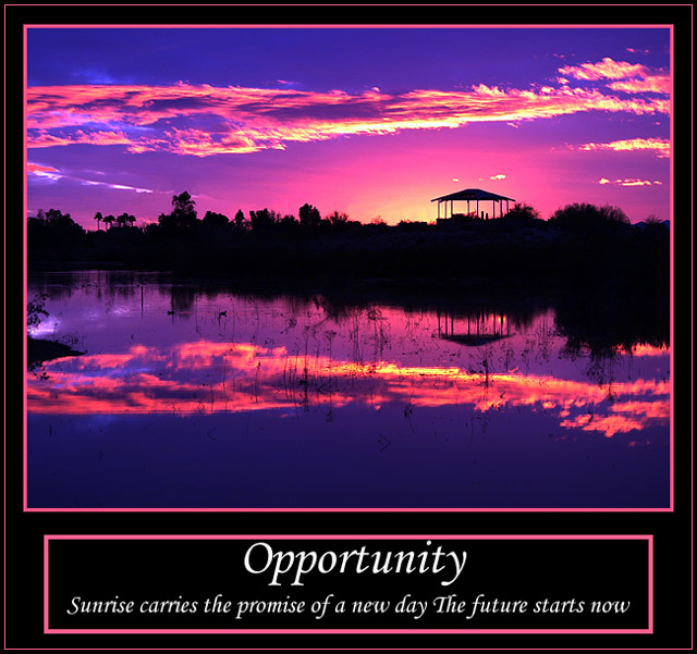
This is such a nice image the colors are strong and bold as well as very strong at grabbing attention. My only dislike for the entire image is those white letters distract from the beauty of the sunset. I'm not sure what color I would have use, if I would have used also the same pink as your boarder or not, but that white seem to pull attention from the beauty of the sunset.
|
|
| Photographer found comment helpful. |
Comments Made During the Challenge  |
|
|
01/04/2004 07:47:05 PM |
|
Great reflection, beautiful colors. Good Job! |
|
| Photographer found comment helpful. |
|
|
01/04/2004 12:58:06 AM |
|
this looks like a nearly great picture that was color manipulated too much, it doesn't look at all natural to me |
|
| Photographer found comment helpful. |
|
|
01/03/2004 04:10:45 PM |
|
Very powerful photo. The pink boarders detract from the two key elements (photo and quote). |
|
| Photographer found comment helpful. |
|
|
01/03/2004 03:12:16 AM |
|
Color is unrealistic For motivation it must be realistic, yet beyond our reach. |
|
| Photographer found comment helpful. |
|
|
01/02/2004 07:03:23 PM |
|
WOW! That is an excellent sunset. Great picture! |
|
| Photographer found comment helpful. |
|
|
01/01/2004 01:20:05 PM |
|
the 2 seperate boxes creates two much seperation......... |
|
| Photographer found comment helpful. |
|
|
12/31/2003 12:04:45 PM |
|
so very true. good choice of borders, i like the double border effect and the slogan is appropriate. |
|
| Photographer found comment helpful. |
|
|
12/31/2003 10:58:57 AM |
|
amazing! truly, truly amazing. The only reason I dont' give you a 10 is because the grammar is wrong. There should be a period after the word 'day' and a period at the end of the sentence. This is the top photo this challenge. GREAT job! Nice reflections, beautiful color, great borders, great scene. |
|
| Photographer found comment helpful. |
|
|
12/30/2003 11:25:12 PM |
|
| Photographer found comment helpful. |
|
|
12/30/2003 06:57:27 PM |
|
Nice choice of image though the colours seem pumped up too much. Message works well. I think the thick pink internal borders around text and image are a mistake and it would work best without either. |
|
| Photographer found comment helpful. |
|
|
12/30/2003 02:53:19 PM |
|
You've certainly made the most of the opportunities in this scene. Great picture. |
|
| Photographer found comment helpful. |
|
|
12/29/2003 10:13:45 PM |
|
lovely photo - i love the color that you've captured. but a couple small things distract me: 1. don't care much for the border color 2. you missed punctuation between "day" and "The", which you've probably noticed by now. |
|
| Photographer found comment helpful. |
|
|
12/29/2003 09:30:37 PM |
|
I love this picture and the saying.Graphically, I would have made the boxes the same width, and perhaps the bottom one with a little thinner line. But I do like the use of picking the color from the poster, but I wonder how the purplish blue would have looked, mabe a little subtler |
|
| Photographer found comment helpful. |
|
|
12/29/2003 02:15:31 PM |
|
I don't like the pink lines. But a beautiful shot none the less. 10 |
|
| Photographer found comment helpful. |
|
|
12/29/2003 02:11:27 PM |
|
I think the colors are way overly saturated (they're clipping), otherwise a nice shot. |
|
| Photographer found comment helpful. |
|
|
12/29/2003 02:06:13 PM |
|
Nice image but the sky is just too pink. I would have scored this higher had the sky\'s color not been played with as much. An more orange cast would have suited this image better than pink. You might have also edited out those two little clouds sitting above the gazebo. |
|
| Photographer found comment helpful. |
|
|
12/29/2003 02:03:39 PM |
|
The photo is good, but the concept doesn't work very well for me. I also hate to be a stickler, but there should be a period/full-stop after 'day'. The pink framing is a bit unsettling as well, and hurts this image. |
|
| Photographer found comment helpful. |
|
|
12/29/2003 01:08:35 PM |
|
Really amazing, vivid colors. Love the photo and reflection. Nice job. |
|
| Photographer found comment helpful. |
|
|
12/29/2003 11:12:58 AM |
|
The thick pink inner border overwhelms this poster. Should have made it 1 pixel wide, or very similar to the outer pink border. The photo is just beautiful. |
|
| Photographer found comment helpful. |
|
|
12/29/2003 09:21:00 AM |
|
The colors are really overdone. Too much for my taste. But a good choice of image and text nevertheless. |
|
| Photographer found comment helpful. |
|
|
12/29/2003 08:50:12 AM |
|
Gorgeous work. Good luck,. |
|
| Photographer found comment helpful. |
|
|
12/29/2003 08:25:46 AM |
|
Wait a second... don't I have this on my new calendar?!!? Just kidding, very nice, reflective shot. |
|
| Photographer found comment helpful. |
|
|
12/29/2003 08:23:26 AM |
|
shouldnt have bordered your text separately unless you were going to make it the same width as the image. |
|
| Photographer found comment helpful. |
|
|
12/29/2003 07:44:47 AM |
|
Interesting. The colors are a little intense - looks over-saturated to me. Would like to see the original. |
|
| Photographer found comment helpful. |
|
|
12/29/2003 07:14:33 AM |
|
I like the photo a lot, but I think the design in the border is a bit too heavy. 8 |
|
| Photographer found comment helpful. |
|
|
12/29/2003 03:09:14 AM |
|
The photo is absolutely gorgeous. The colours are spectacular and the clarity is very good for en evening shot. But you went way over board with the borders. The thin one around the whole frame is fine, but the shocking pink thick border around the image and around the text could have been totally excluded and you would still have a very powerful poster. It kind of spoiled it for me. |
|
| Photographer found comment helpful. |
|
|
12/29/2003 01:57:31 AM |
|
I am awestruck at this photo! It is breathtaking, beautiful! |
|
| Photographer found comment helpful. |
|
|
12/29/2003 01:40:23 AM |
|
I like it, but think I would have preferred the colours slightly more natural, as the pink looks a little fake. |
|
| Photographer found comment helpful. |
Home -
Challenges -
Community -
League -
Photos -
Cameras -
Lenses -
Learn -
Help -
Terms of Use -
Privacy -
Top ^
DPChallenge, and website content and design, Copyright © 2001-2026 Challenging Technologies, LLC.
All digital photo copyrights belong to the photographers and may not be used without permission.
Current Server Time: 06/30/2026 03:13:10 PM EDT.