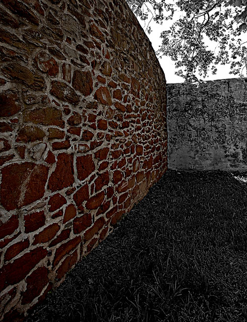
Great leading line here, and perspective, plus wonderful texturess, in this very simple image.....
I also like the color tones that help to balance this image.....
Karen, I like this image. I like the textures and the large blocks it forms. I think the selective desat works very nicely in an almost abstract way. Now that the challenge is over, I think you could have some fun with it by cropping the top down to eliminate all the sky (square aspect ratio) and then putting a gradient map adjustment layer on it. Try all sorts of combinations of colors in the gradient. I think you'll get some really cool abstract images.
Karen, it is a striking wall, but this treatment leads me to wonder why only one part of it is in color. Might it might be better to have both parts in color?






 Add photograph to your favorites
 Add photographer to your favorites

 Photographer found comment helpful.


