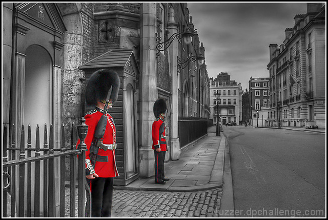
I wandered around London one evening (when it didn't rain) looking for anything that might work in this challenge. It's not until you look that you see everything in London is grey or red!
Editing Steps: Convert from RAW with exposures -2, -1, 0, 1, 2
* shadow contrast +10
* saturation +41
HDR (at the suggestion of my DPL team)
Tone map
Minor Dodge/Burn
Clone out cones on road and some minor distractions
Saturation -28
"s" curve
Levels: 12, 1.04, 247
With the guards clones out
* Saturation -100
Flatten and resize to 640 (because I only have my work laptop and not all the software is installed on it so had to use the demo of Neat Image)
Neat Image
On the legs of the near guard
* blur to remove excessive noise
* Levels: 47, 1.00, 255
Lightness: Reds -13
Lightness: Blues -100
USM
add border
Save for web
Post Challenge: What a great result! The sky has had not dodge/burn applied to it at all. It was the usual overcast day in London and that's how it was. Now, I need to sort out a large version now that I'm back home :)
Statistics
Place: 7 out of 556 Avg (all users): 6.6256 Avg (commenters): 8.1579 Avg (participants): 6.5174 Avg (non-participants): 7.0213 Views since voting: 25835 Views during voting: 348 Votes: 219 Comments: 27 Favorites: 7 (view)
The first three parts of this critique are written based purely on examination of your photo. "Final thoughts" is written after reviewing your score, photographer's comments, and voter comments.
TECHNIQUE My first-glance reaction to the technique is WOW. Very nice BW tones, excellent contrast, sky tones, focus, exposure seems perfect. A very clean image. You nailed the technicals. The conversion to BW was handled very well - I'd love to see what method you used. The selective desat looks perfect as well, right down to the tones of the hats, rifles and pants. Even though it looks as if you selected red only, the hats and pants stand out as well because they're the darkest regions of the photo. Excellent job! One could quibble and say that the sky looks like it may have been manipulated a bit (a little dodge/burn?) but I don't take issue with that. It's done very well and greatly compliments the dirty, sooty textures of the buildings.
COMPOSITION I love the composition - an artistic success! The angles and lines created by the curb, street and buildings makes for a perfect vanishing point centered nearly perfectly on a third. The image is well balanced between foreground subjects and the gradually receding facades. Everything is detailed and sharp. The image provides a wealth of fodder for the wandering eye. The guards are interesting all by themselves because of that reputation for stoic indifference. Your use of desat to highlight them is just genius. Honestly, I can't find anything about the composition that I don't like.
EMOTIONAL IMPACT Very well done picture, you should be proud to have made it. There is feel of isolation and desolation that is enhanced by the gray tones. Even the colorful subjects don't disturb that sense because they're almost statue-like in their indifference to their surroundings. The only problem with a picture like this is that the measly 640 pixels doesn't begin to do it justice. I long to see this image in a larger format where I could feast upon it for hours! If you don't have a print available of this yet, shame. If you don't have a 16x24 hanging on your own wall, what's wrong with you!?
You can probably guess that I'm liking this shot. It grabs and keeps my attention. It has a subtle "wow" factor that is elusive. It provokes my imagination and makes me want to look and then look more.
FINAL THOUGHTS I'm gratified to see that this scored high, but disappointed not to see a ribbon beside it. I didn't enter or vote this challenge so I 'm not sure how strong the field was, but your shot is a winner in my book. I don't really "get" the whole tone mapping thing, and many examples I've seen in previous challenges and the forums make me less than excited about the method, but your shot proves the value of this technique.
Well done; superb photograph! Take heed on my comments about the print! I'll buy!
Very nice selective desaturation, makes you focus on the guards, I also like the leading lines. One thing I would try is making the B&W tones more contrasty because it is looking a little "flat" to me. Either way good shot ;), 7






 Add photograph to your favorites
 Add photographer to your favorites

 Photographer found comment helpful.


