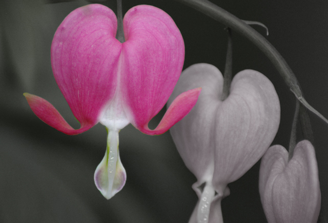
Hi Julie. I think this is pretty, but could be improved by:
1) Sharpening it up a bit (if the original is blurred, then oh, well)
2) Cropping less tightly at the top
3) Coloring the other blooms (it would have more of a look of the third-place shot, with the repeating object)
But you did a good job with the coloring and how you kept the other blooms bright with a dark background.
Huh?? I do NOT get that score at all. I swear, I have no clue when it comes to this place sometimes. I quite like this. Soft, gentle, and I like the partial desat on the background hearts.






 Add photograph to your favorites
 Add photographer to your favorites

 Photographer found comment helpful.


