| Author | Thread |
Comments Made During the Challenge  |
|
|
12/27/2003 11:55:18 PM |
|
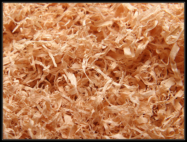
The arrangement is too random; there isn't anything to catch the viewer's interest. |
|
 Photographer found comment helpful. Photographer found comment helpful. |
|
|
12/27/2003 10:02:29 PM |
|
Almost a Pollock composition- he would have used mosre contrast whiter whites instead of cream- and deeper blacks behind the whites. What is also strange is that unlike in painting, there are focal spots in your photo- blurry and sharp. I really like your composition and more people should do shots like this. |
|
| Photographer found comment helpful. |
|
|
12/27/2003 01:02:02 PM |
|
Very good focus, DOF, and execution. Just doesn't hold alot of interest. Looks almost like a corner in my shop |
|
| Photographer found comment helpful. |
|
|
12/26/2003 09:37:49 AM |
|
Simple and very good. Like the colour and even lighting. 10 |
|
| Photographer found comment helpful. |
|
|
12/24/2003 09:07:24 AM |
|
Needs one strong element as focal point in my opinion. Detail, color and structure is good. |
|
| Photographer found comment helpful. |
|
|
12/23/2003 02:08:21 PM |
|
| Photographer found comment helpful. |
|
|
12/22/2003 04:51:57 PM |
|
| Photographer found comment helpful. |
|
|
12/22/2003 09:18:12 AM |
Technical: fits the challenge. Exposure composition focus lighting all good.
Personal: I think not having a single subject to rest my eyes on makes this a weaker photo for me.
My vote: 5 |
|
| Photographer found comment helpful. |
|
|
12/22/2003 08:40:38 AM |
|
Different, yet not really engaging. Nice focus. |
|
| Photographer found comment helpful. |
Home -
Challenges -
Community -
League -
Photos -
Cameras -
Lenses -
Learn -
Help -
Terms of Use -
Privacy -
Top ^
DPChallenge, and website content and design, Copyright © 2001-2026 Challenging Technologies, LLC.
All digital photo copyrights belong to the photographers and may not be used without permission.
Current Server Time: 06/28/2026 11:27:06 PM EDT.