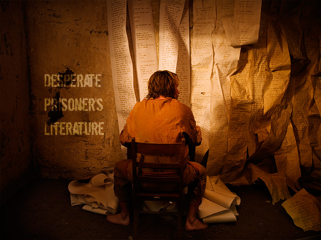
I think it would be as strong or stronger an image cropped to a square ... I really like the lighting, though on my monitor it looks a little more "orangey" than I'd have made it -- I think I'd try and make it a duller brown.
DPL started as a front for Alan Lomax's latest prison songs collection, a desperate attempt by his label to improve sales, which even went so far as to create a work-release program for some of the songbird convicts and send them on tour. These convicts bonded on the road and decided to forget the traditional ballads and write their own material. Unfortunately, they were unable to find a label or even a producer to help them record the radical ideas in their lyrics, a hint of which you can get from the titles alone:
Wow. What an intriguing image. Really interesting. Like that spot lighting and the colour temperature too. Personally I think it would be stronger in a square crop, losing from the left side only, so his back is near the left edge and he's facing into the main space of the image. Band name could fit in at lower right or upper right. But works well as is too.
Great idea and nicely executed. If the text was added in Photoshop then two "thumbs up" for not just plonking it in the blank spot like so many other people have done. 8
very good idea, very good lighting,very good typography - this would have been a winner if it was cropped to square format - I had cropped off about 10% at left and 23% at right




 Add photograph to your favorites
 Add photographer to your favorites


 Photographer found comment helpful.


