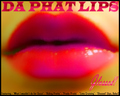
I struggled with this for days now. But finally the name suddenly came to me. With that, I got the image in my head.
I decided against adding text because I thought it made it look cheesy. Not that the picture is supposed to be serious or anything. But the text took away from the humor.
I don't expect this to do very well, but I'm here to learn.
PP:
Rotate
Auto Color
Auto Contrast
Hue/Saturation
USM
Image Size
Save For Web
Statistics
Place: 136 out of 153 Avg (all users): 4.9023 Avg (commenters): 5.7857 Avg (participants): 4.4875 Avg (non-participants): 5.1481 Views since voting: 1064 Views during voting: 386 Votes: 215 Comments: 19 Favorites: 0
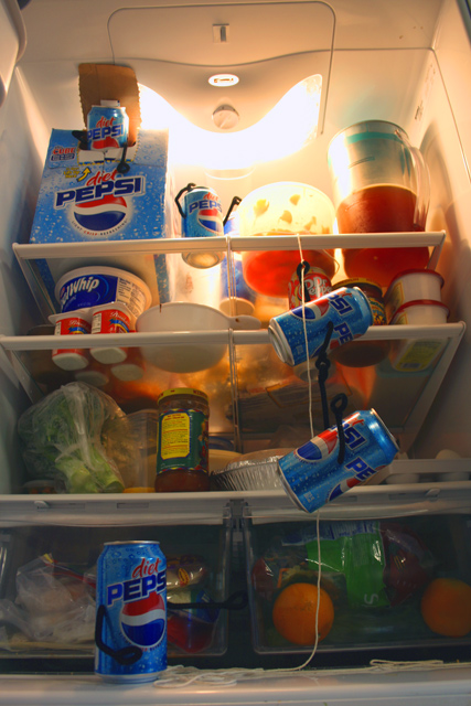
Camera Work/Technical: Nice focus and also very nice color. Your point of view illustrates well exactly what your were looking to convey.
Lighting: I think that the lighting is what cost you the most points here. Maybe a little fill flash at the bottom of the frame would have helped balance that strong light at the top of the frame.
Composition/Content: In one word, cluttered. I agree with the other posters that taking some of the goodies out of the refrigerator would have helped out a bit. As it is, the cleverness of the cans escaping gets lost in the business of the contents.
My Opinion: Comical and very creative, perhaps one of the more creative entries of the challenge. With a little better lighting and a little less business in the fridge, I think that you'd have pulled a better score.
Thank you for the opportunity to provide a critique on your entry,
Eric
this isn't really shaped like an album (square). It's a neat idea, but the lighting doesn't work. Maybe some additional light outside of the refrigerator?






 Add photograph to your favorites
 Add photographer to your favorites


 Photographer found comment helpful.


